22.11 Slicer vs Filter: When to Use Which
Start with a problem
Salman asks whether to add City as a slicer or as a page filter.
Explain simply
Use a slicer when users should see and change the choice on the canvas. Use a Filters pane filter for fixed scope (locked/hidden) or less important options.
Show the data
| Need | Choose |
|---|---|
| Manager changes city daily | Slicer |
| Always exclude test store | Hidden locked filter |
| Rarely used Payment mode | Filters pane |
About this data: This table uses columns: Need, Choose. This table uses columns: Field, Placement. This table uses columns: Slicer, Filters pane. This table uses columns: Wrong result, Reason, Correction. Values shown are the lesson examples already on this page (not a new dataset).
Fictional sample data. Practice file: visuals_orders_apr_may_2026.csv (source: src/practice/).
Demonstrate
- List each filter field and who changes it.
- Put frequently changed fields as slicers (max 3–4).
- Put fixed scope as locked filters.
- Put rare fields in the Filters pane, renamed clearly.
Show the result
Your result should look like this (fictional sample):
| Field | Placement |
|---|---|
| City | Slicer |
| Status = Delivered | Locked filter (if the page is delivery-only) |
| Payment mode | Filters pane |
Explain what happened
Both create filters in the same filter context; the difference is visibility and control.
Explore further
- Mobile layouts benefit from fewer slicers.
Detailed reference for this lesson:
| Slicer | Filters pane | |
|---|---|---|
| Visible on canvas | Yes | Only in the pane |
| Takes canvas space | Yes | No |
| Obvious to users | Very | Less (users may miss it) |
| Levels | Page (sync for more pages); via Edit interactions | Visual, page, all pages, drill-through |
| Filter types | List, range, relative date/time | Basic, advanced, Top N, relative, measure filters |
| Lock/hide | Hide via Selection pane; no lock | Lock and hide per filter |
| Best for | Choices users change often (Platform, City, Date) | Fixed conditions (exclude test stores, Top N, India only) |
Ravindra Bagale's Tip
A common mistake is making every filter a slicer "so users can see it". Slicers take space and run queries. Put frequently changed choices on the canvas and fixed scope in the Filters pane. Keep this in mind!
Ravindra Bagale's Tip – मराठी
एक common चूक म्हणजे "users ना दिसावा" म्हणून प्रत्येक filter slicer म्हणून ठेवणं. Slicers जागा घेतात आणि queries चालवतात. वारंवार बदलणाऱ्या निवडी canvas वर ठेवा आणि fixed scope Filters pane मध्ये. लक्षात ठेवा!
Ravindra Bagale's Tip – हिंदी
एक common गलती है हर filter को slicer बना देना "ताकि users देख सकें". Slicers जगह लेते हैं और queries चलाते हैं. बार-बार बदलने वाली choices canvas पर रखो और fixed scope को Filters pane में. ध्यान रखना!
Fix common mistakes
| Wrong result | Reason | Correction |
|---|---|---|
| Too many slicers | Everything placed on canvas | Move rare fields to the Filters pane |
| Users cannot find a filter | Hidden pane | Show the Filters pane or use a panel |
| Different numbers on pages | Page filters differ | Document scope |
Practise independently
Practice task
Where would you put Platform on the platform comparison page?
Hints
- Is it changed often?
Solution
As a slicer (or field parameter) – users compare Blinkit and Amazon Now actively.
Think like a professional
This design choice shows user empathy, which interviewers value.
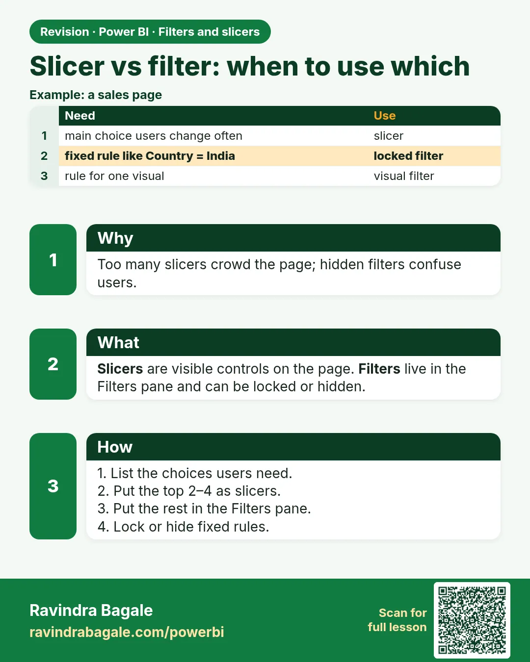 Revision card