Labs · Power BI
Lab: Redesign a Cluttered Report Page with the 5-Second Rule
Course: Power BI · Chapter 23: Report and Dashboard Design Principles
Chapter 23 teaches report and dashboard design principles; this lab applies them to one bad page.
Download pbi_sales.csv (24 orders) Download pbi_cities.csv Download pbi_products.csv
Chala mitrano! Here is a test for any report page: show it to someone for five seconds, then hide it and ask "what did you learn?" If they say "lots of colours", the page failed. Today we first build an ugly page on purpose, laugh at it, and then fix it step by step. Kami jaast, spashta jaast!
चला मित्रांनो! कोणत्याही report page साठी एक test: कोणालातरी पाच सेकंद दाखवा, मग लपवा आणि विचारा "काय कळलं?" ते म्हणाले "खूप रंग", तर page fail झालं. आज आधी मुद्दाम एक कुरूप page बनवू, त्यावर हसू, आणि मग step by step सुधारू. कमी जास्त, स्पष्ट जास्त!
चलो दोस्तों! किसी भी report page का एक test: किसी को पाँच सेकंड दिखाओ, फिर छुपाओ और पूछो "क्या समझ आया?" अगर वह कहे "बहुत सारे रंग", तो page fail। आज पहले जानबूझकर एक बदसूरत page बनाएंगे, उस पर हँसेंगे, और फिर step by step ठीक करेंगे। कम चीज़ें, ज़्यादा साफ!
Suppose we are…
Suppose a colleague at Croma built the "Sales Dashboard" in a hurry: everything he could think of on one page. The regional director opens it in the Monday meeting, stares for a minute and asks: "So… are we on target or not?" Nobody can answer quickly. Our job: redesign the page so the director gets the answer in 5 seconds. The numbers are sample data made up for practice.
The 5-second rule: a reader should understand the page's main message within 5 seconds. Here the main question is: "Are we on target, and where are we not?"
Goal of this lab
By the end you will have:
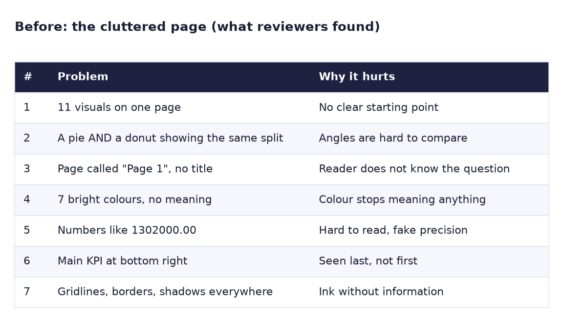
- A "before" page with 11 visuals and a written list of its 7 problems.
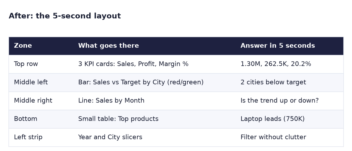
- An "after" page with 3 KPI cards, a red/green bar chart, a trend line, one small table and a slicer strip.
- Passed the 5-second test with a friend or family member.
What you need (all free)
- Power BI Desktop and your Lab 20 file (it has Total Sales, Target Amount, Bar Colour and Chart Title). Lab 14's Units and Orders measures help too.
- Sample data if you need to rebuild: Download pbi_sales.csv (24 orders) Download pbi_cities.csv Download pbi_products.csv
- A sheet of paper and a friend for the 5-second test.
- 45 minutes.
The data: before and after
Before. What reviewers found on the cluttered page.
After. The 5-second layout: each zone answers one question.
The formula
You already have the measures. Add the two that the KPI row needs if they are missing:
Total Profit = SUM ( pbi_sales[Sales] ) - SUM ( pbi_sales[Cost] )
Margin % = DIVIDE ( [Total Profit], [Total Sales] )
The real "formula" today is the layout. People read a page like the letter Z: top left → top right → down to the middle → bottom. So:
- Top left: the most important number (Total Sales), then Profit and Margin %.
- Middle left: the answer to the main question (bar chart vs target, red/green, title "2 of 4 cities below target").
- Middle right: the trend (line by month).
- Bottom: detail for those who want it (top products).
Steps
Part A: build the bad page (10 minutes, quickly)
- Open your Lab 20 file and Save as
Lab-23-redesign. Add a page called Before. - Throw on these 11 visuals without formatting: 6 cards (Total Sales, Cost, Units, Orders, Total Profit, Target Amount), a Pie of Total Sales by Product, a Donut of Total Sales by Product, a Gauge of Total Sales, a Table with every column of pbi_sales, and a Line chart of Sales by DateTable[Date].
-
Select the Total Sales card and set Format → Callout value → Display units: None, Value decimal places: 2.
What you should see: 1302000.00 and a page where your eyes jump around with nowhere to land.
-
On paper, write the 7 problems from the Before image next to the visuals that cause them.
Part B: redesign (30 minutes)
- Right-click the Before tab → Duplicate page. Rename the copy After.
- Write the main question at the top of your paper: "Are we on target, and where are we not?" Sketch the Z layout from "The formula".
- On After, delete: the donut, the gauge, the big 24-row table, the Cost, Units, Orders and Target Amount cards, and the pie. Keep Total Sales and Total Profit cards; add a Margin % card.
-
Put the three cards in a row at the top. Set display units to Auto and decimals to Auto.
What you should see: 1.30M, 262.5K (or 262.50K) and 20.16%.
-
Middle left: copy the red/green bar chart vs target from your Lab 20 page and paste it here (choose Keep if asked about syncing). Its title must say 2 of 4 cities below target.
- Middle right: change the line chart's X-axis from Date to DateTable[Month] with Year in Legend (as in Lab 14). Title:
Sales by month, 2025 vs 2026. -
Bottom: a small Table with pbi_products[Product] and Total Sales, sorted descending, title
Top products.What you should see: Laptop 750,000 at the top.
-
Left strip: add slim Year (DateTable[Year], dropdown) and City slicers.
- Clean up: View → Themes and pick one calm theme; in each visual turn off borders and shadows and remove vertical gridlines; select visuals in a row and use Format → Align → Align top and Distribute horizontally.
- Rename the page tab to Sales vs Target. Add a text box title at the top:
Sales vs target – Maharashtra stores. -
5-second test. Show the After page to someone for 5 seconds, then hide it. Ask: "Are we on target?"
What you should see: they answer something like "Mostly, but Pune and Nashik are below target." Try the same with the Before page: usually no clear answer.
-
Save.
Ravindra Bagale's Tip
Every visual must earn its place. Ask of each one: "Which question does it answer, and would anyone miss it if I removed it?" If you cannot name the question, delete the visual. Deleting is the most powerful design tool in Power BI. Kaadhun taka, report sudhara!
Ravindra Bagale's Tip – मराठी
प्रत्येक visual ने स्वतःची जागा कमवायला हवी. प्रत्येकासाठी विचारा: "हा कोणत्या प्रश्नाचं उत्तर देतो, आणि काढला तर कोणाला त्याची आठवण येईल का?" प्रश्नाचं नाव सांगता येत नसेल तर visual delete करा. Delete करणं हे Power BI मधलं सगळ्यात ताकदवान design tool आहे. काढून टाका, report सुधारा!
Ravindra Bagale's Tip – हिंदी
हर visual को अपनी जगह कमानी चाहिए। हर एक से पूछो: "यह किस सवाल का जवाब देता है, और हटा दूँ तो क्या किसी को इसकी कमी खलेगी?" सवाल का नाम नहीं बता सकते, तो visual delete करो। Delete करना Power BI का सबसे ताकतवर design tool है। हटा दो, report सुधारो!
Common mistakes
| Mistake | What happens | Fix |
|---|---|---|
| Keeping every visual "because someone might need it" | Clutter returns | Move detail to a drill-through page (Lab 17) |
| Main KPI at the bottom right | It is read last | Top left, following the Z pattern |
| Pie and donut for the same split | Two hard-to-read visuals saying one thing | One sorted bar or a small table |
| Many colours with no meaning | Red stops meaning "bad" | One theme; colour only for meaning (red/green vs target) |
| Titles like "Sum of Sales by City" | The reader must work out the message | Write the message: "2 of 4 cities below target" |
| 2 decimal places on big numbers | Fake precision and long labels | Display units Auto; decimals only for percentages |
Self-check checklist
0 of 5 done
Try-at-home challenge
Open any public Power BI report (for example from the Power BI community "Data Stories Gallery") and apply the 5-second test to it. Write 3 problems and 3 fixes, in the same format as the Before/After images.
Check your answer
There is no single right answer. A good review names the main question first, then each problem with its effect on the reader ("the KPI is bottom right, so it is read last") and a specific fix ("move the KPI card top left; make it the biggest font on the page"). Avoid vague notes like "make it nicer". If you can, show your 3 fixes to the same person and repeat the 5-second test.
Samjla ka? One main question, a Z layout, fewer visuals and colour only for meaning. Aata pudhe jaauya: build a complete one-page sales report with KPIs, a trend and a breakdown.