Labs · Power BI
Lab: Mini Project – Build a Quick-Commerce Dashboard from Raw CSV to Published Report
Course: Power BI · Chapter 28: End-to-End Project: Blinkit Quick-Commerce Dashboard
Chapter 28 is the Blinkit end-to-end project; this lab is a shorter version you can finish in one sitting.
Chala mitrano! Today no hand-holding for every click: you have learnt the skills, now you use them together. Raw CSV in, finished dashboard out, plus three insights in plain English. This is exactly what a fresher gets in a take-home assignment. Swatah kara, mag answer bagha!
चला मित्रांनो! आज प्रत्येक click साठी हात धरणार नाही: skills तुम्ही शिकलात, आता त्या एकत्र वापरा. Raw CSV आत, तयार dashboard बाहेर, आणि सोप्या English मध्ये तीन insights. Fresher ला take-home assignment मध्ये नेमकं हेच मिळतं. स्वतः करा, मग answer बघा!
चलो दोस्तों! आज हर click पर हाथ नहीं पकड़ेंगे: skills आपने सीख लीं, अब उन्हें साथ में इस्तेमाल करो। Raw CSV अंदर, तैयार dashboard बाहर, और आसान English में तीन insights। Fresher को take-home assignment में ठीक यही मिलता है। खुद करो, फिर answer देखो!
Suppose we are…
Suppose we have joined the analytics team of Blinkit in Pune. Quick commerce promises groceries in about 10 minutes from small warehouses called dark stores. The city lead wants a dashboard for March: "How much did we deliver, how fast, which dark store is slow, what sells, and when are we busiest?"
We have blinkit_orders.csv: 60 orders from 4 dark stores (Kothrud, Baner, Wakad, Viman Nagar). It is sample data made up for practice, not real Blinkit figures.
Goal of this lab
By the end you will have:
- A cleaned table with Date and Hour columns.
- 7 measures: Orders, Delivered Orders, GMV, AOV, Avg Delivery Mins, In 10 Min %, Cancel %.
- One page: 5 KPI cards, a dark-store table with red highlighting, a category bar chart and an orders-by-hour chart.
- Three written insights.
- The report published to your My workspace (or exported to PDF if you have no work/school account).
What you need (all free)
- Power BI Desktop.
- Download blinkit_orders.csv (60 orders, 4 dark stores)
- 80 minutes.
The data: before and after
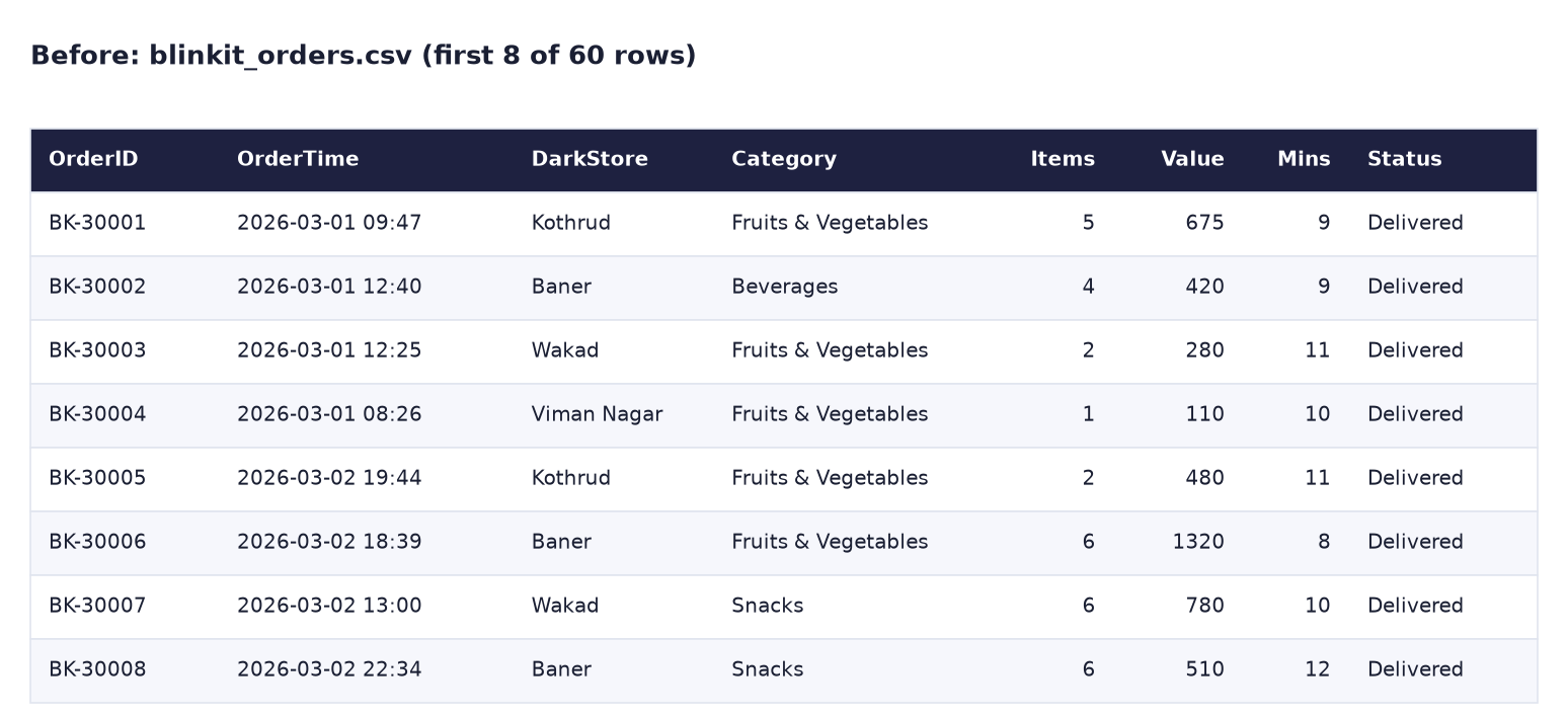
Before. Raw orders: one row per order, OrderTime as text, cancelled orders with no delivery time.
After (1). The KPI row.

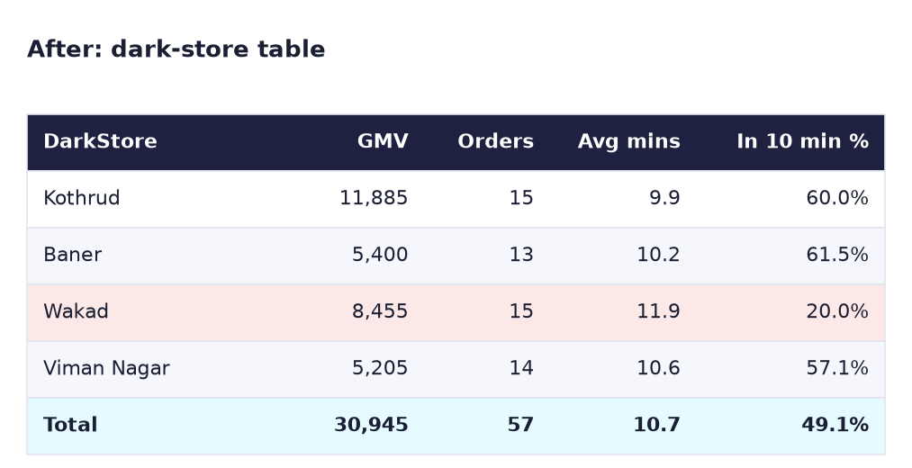
After (2). The dark-store table. Wakad is highlighted red: only 20% of its orders arrive within 10 minutes.
The formula
Orders            = COUNTROWS ( blinkit_orders )
Delivered Orders  = CALCULATE ( [Orders], blinkit_orders[Status] = "Delivered" )
GMV               = CALCULATE ( SUM ( blinkit_orders[OrderValue] ), blinkit_orders[Status] = "Delivered" )
AOV               = DIVIDE ( [GMV], [Delivered Orders] )
Avg Delivery Mins = AVERAGE ( blinkit_orders[DeliveryMins] )
In 10 Min %       = DIVIDE ( CALCULATE ( [Delivered Orders], blinkit_orders[DeliveryMins] <= 10 ), [Delivered Orders] )
Cancel %          = DIVIDE ( CALCULATE ( [Orders], blinkit_orders[Status] = "Cancelled" ), [Orders] )
- GMV counts delivered orders only (as in Lab 1).
- AVERAGE skips blank cells, so the 3 cancelled orders (no DeliveryMins) do not pull the average down.
- In 10 Min %: 28 of 57 delivered orders took 10 minutes or less = 49.1%.
- Cancel %: 3 of 60 = 5.0%.
Steps
Part A: load and clean (15 min)
- Get data → Text/CSV → blinkit_orders.csv → Transform Data.
- Check types: OrderTime = Date/Time, Items, OrderValue, DeliveryMins = Whole Number. If OrderTime is text, use Change Type → Using Locale → Date/Time, English (India).
-
Select OrderTime → Add Column → Date → Date Only; rename it Date. Select OrderTime again → Add Column → Time → Hour → Hour; rename it Hour.
What you should see: BK-30001 has Date 01-03-2026 and Hour 9. 60 rows; DeliveryMins is null for BK-30010, BK-30024 and BK-30042 (the cancelled orders).
-
Close & Apply.
Part B: measures (15 min)
- Create the 7 measures from the formula box. Format AOV with 0 decimals, Avg Delivery Mins with 1 decimal, and In 10 Min % and Cancel % as percentages.
Part C: the page (30 min)
-
KPI row: 5 cards: GMV, Delivered Orders, AOV, Avg Delivery Mins, In 10 Min %.
What you should see: 30.95K (or 30.9K), 57, 543, 10.7, 49.1%.
-
Dark-store table: DarkStore, GMV, Delivered Orders, Avg Delivery Mins, In 10 Min %. Then Format → Cell elements, pick In 10 Min %, switch on Background color, click fx, choose Rules: if value < 0.5 (Number) then light red. Click OK.
What you should see: Wakad's 20.0% cell turns red. Kothrud has the highest GMV (11,885) and the fastest average (9.9 min).
-
Category bar chart: Category × GMV, sorted descending.
What you should see: Fruits & Vegetables 9,325, Snacks 7,340, Personal Care 6,930, Beverages 4,375, Dairy 2,975.
-
Orders by hour: a Column chart with Hour on the X-axis (set the X-axis Type to Categorical) and Orders on the Y-axis.
What you should see: two peaks: lunch (12–13 h) and evening (18–21 h). 13:00 and 20:00 have 11 orders each.
-
Add a Slicer on DarkStore, a title
Pune quick commerce – March 2026 (sample data), align everything and save asLab-28-blinkit.
Part D: insights (15 min)
- Write three insights in a text box at the bottom of the page, each with a number and an action. Then compare with the answer below.
Check your insights
- Wakad is slow: only 20% of Wakad orders arrive within 10 minutes (average 11.9 min) against about 60% in the other stores. Action: check rider count and the store's catchment area.
- Fruits & Vegetables lead: 9,325 of 30,945 GMV (30%). Action: protect fresh stock availability at peak hours.
- Two daily peaks: 12–13 h (19 orders) and 18–21 h (30 orders). Action: plan rider shifts around these hours.
Good insights always have a number, a comparison and an action.
Part E: publish (5 min)
-
Press Ctrl + S, then Home → Publish. Sign in with your work or school account (as in Lab 25) and choose My workspace.
What you should see: "Success! Opening 'Lab-28-blinkit.pbix' in Power BI". Click the link: the same page opens in the browser, with the slicer working.
-
No work or school account? Use File → Export → Export to PDF instead and keep the PDF with your project. Either way, the result is something you can show in an interview.
Ravindra Bagale's Tip
In an assignment, the insights matter more than the colours. Interviewers read your three lines first, then look at the dashboard to see if the numbers support them. "Wakad delivers only 20% within 10 minutes vs about 60% elsewhere" beats "Wakad is a bit slow". Number, tulana, action!
Ravindra Bagale's Tip – मराठी
Assignment मध्ये रंगांपेक्षा insights जास्त महत्त्वाचे. Interviewers आधी तुमच्या तीन ओळी वाचतात, मग numbers त्यांना support करतात का ते dashboard मध्ये बघतात. "Wakad फक्त 20% orders 10 मिनिटांत देतो, बाकी ठिकाणी साधारण 60%" हे "Wakad थोडा slow आहे" पेक्षा खूप चांगलं. Number, तुलना, action!
Ravindra Bagale's Tip – हिंदी
Assignment में रंगों से ज़्यादा insights मायने रखते हैं। Interviewers पहले आपकी तीन lines पढ़ते हैं, फिर dashboard में देखते हैं कि numbers उनका साथ देते हैं या नहीं। "Wakad सिर्फ 20% orders 10 मिनट में देता है, बाकी जगह लगभग 60%" यह "Wakad थोड़ा slow है" से कहीं बेहतर है। Number, तुलना, action!
Common mistakes
| Mistake | What happens | Fix |
|---|---|---|
| GMV = SUM of all OrderValue | 32,325, which includes the 3 cancelled orders | Filter Status = "Delivered" inside CALCULATE |
| DeliveryMins of cancelled orders typed as 0 | Average delivery time drops below the truth | Keep them blank (null); AVERAGE ignores blanks |
| Hour axis shown as continuous | Bars become thin and labels odd (8.5, 9.5…) | X-axis Type → Categorical |
Rule < 50 instead of < 0.5 |
Every store turns red (percentages are stored as 0–1) | Use 0.5 with Number, or choose Percent in the rule |
| Insights with no numbers | They sound like opinions | Number + comparison + action |
Self-check checklist
0 of 6 done
Try-at-home challenge
The city lead asks: "If Wakad reached the same 10-minute rate as Kothrud (60%), how many more Wakad orders would have arrived on time in March?"
Check your answer
Wakad delivered 15 orders; 20% on time = 3 orders. At 60% it would be 9 orders. So 6 more on-time orders. In DAX you could show it as CALCULATE ( [Delivered Orders], blinkit_orders[DarkStore] = "Wakad" ) * ( 0.6 - [In 10 Min %] ) with a Wakad filter, but a simple sentence with the numbers is enough for the lead.
Samjla ka? Clean, measure, build, then explain with numbers. Aata pudhe jaauya: a timed practice, 3 visuals from a new dataset in 45 minutes.