Labs · Power BI
Lab: Plot Sales by Maharashtra District on a Map and Fix Wrong Locations with Data Category
Course: Power BI · Chapter 15: Maps: Showing Maharashtra on a Map
Chapter 15 is about maps for Maharashtra; this lab plots district sales and fixes the classic wrong-location problem.
Chala mitrano! Maps look impressive, but they have one famous trap: the map service guesses where a name is. "Aurangabad"? There is one in Maharashtra and one in Bihar. Today we make a map of our districts and then remove the guessing completely. Naav purna, jaaga barobar!
चला मित्रांनो! Maps छान दिसतात, पण त्यात एक प्रसिद्ध सापळा आहे: map service नाव कुठे आहे याचा अंदाज लावते. "Aurangabad"? एक महाराष्ट्रात आहे आणि एक बिहारमध्ये. आज आपण आपल्या districts चा map बनवू आणि मग अंदाज पूर्णपणे काढून टाकू. नाव पूर्ण, जागा बरोबर!
चलो दोस्तों! Maps शानदार दिखते हैं, लेकिन उनमें एक मशहूर जाल है: map service अंदाज़ा लगाती है कि नाम कहाँ है। "Aurangabad"? एक महाराष्ट्र में है और एक बिहार में। आज हम अपने districts का map बनाएंगे और फिर अंदाज़ा पूरी तरह हटा देंगे। नाम पूरा, जगह सही!
Suppose we are…
Suppose we work for Amul's Maharashtra distribution team. The head of sales wants a map of last quarter's sales in 10 districts, to decide where to add a new cold-storage depot. A map is the right visual because the question is about where. The numbers are sample data made up for practice.
The trap: Power BI sends each name to an online map service (Bing Maps for the Map visual, Azure Maps for the newer Azure Maps visual), and the service guesses the place. Aurangabad is also a district in Bihar, and Amravati is very close to Amaravati, the capital region of Andhra Pradesh. Without more context, a bubble can land in the wrong state.
Goal of this lab
By the end you will have:
- A bubble map of 10 districts sized by Sales (total 2,120,000).
- Fixed ambiguous names with a Location column ("Aurangabad, Maharashtra, India") and Data category = Place.
- A second map that uses Latitude and Longitude, so no guessing happens at all.
What you need (all free)
- Power BI Desktop and an internet connection (maps load online).
- The file: Download mh_district_sales.csv (10 districts with lat/long)
- 30 minutes.
The data: before and after
Before. District names only. Two names are risky.
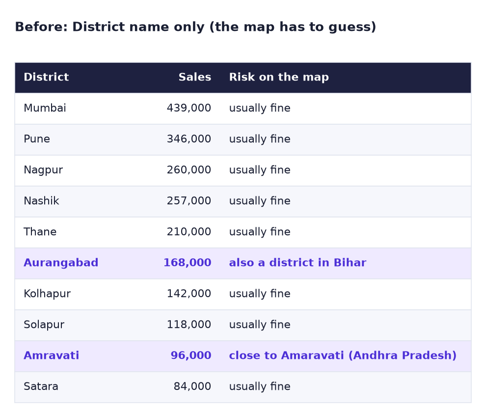
After. A full place name with a Data category, or exact coordinates.

The formula
One DAX calculated column gives the map service the full address:
Location = mh_district_sales[District] & ", Maharashtra, India"
& joins text, so "Aurangabad" becomes "Aurangabad, Maharashtra, India". Then we tell Power BI what kind of value this is with Column tools → Data category → Place. The more specific the text and the category, the less the service has to guess.
Coordinates are even better: Latitude (north–south, about 16 to 22 for Maharashtra) and Longitude (east–west, about 72 to 80) point to one exact spot.
Steps
- In Power BI Desktop, check that map visuals are allowed: File → Options and settings → Options → Global → Security, and tick Use Map and Filled Map visuals if you see it. Click OK and restart Power BI if asked.
-
Get data → Text/CSV → mh_district_sales.csv → Load.
What you should see: a table with District, Sales, Latitude and Longitude (10 rows).
-
In Table view, select Latitude and set Column tools → Data category → Latitude and Summarization → Don't summarize. Do the same for Longitude (category Longitude).
-
In Report view, click the Map icon (the globe) in Visualizations. Location: District, Bubble size: Sales.
What you should see: bubbles over western India. Zoom out (mouse wheel) and look at the whole country. With names only, a bubble such as Aurangabad or Amravati may appear outside Maharashtra: the result depends on the map service's guess that day.
-
Now the fix. Go to Table view, select the table and click Table tools → New column. Type the Location formula from above and press Enter.
-
With the Location column selected, set Column tools → Data category → Place.
What you should see: a small globe icon next to Location in the Data pane.
-
Back in Report view, select the map and replace District with Location in the Location box. Put District into Tooltips so the hover text stays short.
What you should see: all 10 bubbles inside Maharashtra. Mumbai and Thane sit close together on the coast; Nagpur and Amravati in the east.
-
Make a second map for the exact method: click empty canvas → Map. Put Latitude in Latitude, Longitude in Longitude, Sales in Bubble size and District in Tooltips.
What you should see: the same 10 bubbles in exactly the same places. Hover over the biggest: Mumbai 439,000.
-
Give both maps the title
Sales by district, Maharashtra. Save asLab-15-maharashtra-map.
Map, Filled map and Azure Maps
Microsoft plans to retire the Bing-based Map and Filled map visuals and recommends the newer Azure Maps visual. If your Power BI shows an Upgrade maps prompt (it needs a work or school sign-in where your admin has allowed Azure Maps), the same fixes apply: a full place name, the right Data category, or coordinates.
Ravindra Bagale's Tip
Whenever you make a map, zoom out once and look at the whole country or the whole world. A wrong bubble far away is easy to miss when the map auto-zooms to the area. Real companies have shown "Pune" sales in the wrong place in board meetings. Ekda zoom out kara!
Ravindra Bagale's Tip – मराठी
प्रत्येक वेळी map बनवल्यावर एकदा zoom out करा आणि संपूर्ण देश किंवा संपूर्ण जग बघा. Map आपोआप area वर zoom होतो तेव्हा लांबचा चुकीचा bubble सहज सुटतो. खऱ्या companies नी board meetings मध्ये "Pune" चे sales चुकीच्या जागी दाखवले आहेत. एकदा zoom out करा!
Ravindra Bagale's Tip – हिंदी
जब भी map बनाओ, एक बार zoom out करके पूरा देश या पूरी दुनिया देखो। Map अपने आप area पर zoom हो जाए तो दूर का गलत bubble आसानी से छूट जाता है। असली companies ने board meetings में "Pune" की sales गलत जगह दिखाई है। एक बार zoom out करो!
Common mistakes
| Mistake | What happens | Fix |
|---|---|---|
| Map visual missing or grey | Maps are switched off in Options | Options → Security → Use Map and Filled Map visuals |
| Latitude left as Sum | Bubbles appear in the sea or at strange places | Summarization → Don't summarize for Latitude and Longitude |
| Latitude and Longitude swapped | Bubbles in the Indian Ocean or Central Asia | Latitude ≈ 16–22, Longitude ≈ 72–80 for Maharashtra |
| Location column without Data category | Better, but the service still treats it as plain text | Data category → Place |
| Using a Filled map for districts | Shapes may not exist for Indian districts | Use a bubble Map, or a custom shape map with your own map file |
| No internet | Grey map with no tiles | Maps need an internet connection |
Self-check checklist
0 of 5 done
Try-at-home challenge
Colour the bubbles by division. Add a column with SWITCH: Mumbai and Thane are Konkan; Pune, Kolhapur, Solapur and Satara are Pune; Nashik is Nashik; Nagpur is Nagpur; Aurangabad is Aurangabad; Amravati is Amravati. Put it in the map's Legend. Which division sells the most?
Check your answer
Division =
SWITCH ( mh_district_sales[District],
    "Mumbai", "Konkan", "Thane", "Konkan",
    "Pune", "Pune", "Kolhapur", "Pune", "Solapur", "Pune", "Satara", "Pune",
    mh_district_sales[District] )
The last argument is the "else" value: Nashik, Nagpur, Aurangabad and Amravati keep their own name, which is also their division. In a table by Division: Pune 690,000 (346 + 142 + 118 + 84 thousand), Konkan 649,000, Nagpur 260,000, Nashik 257,000, Aurangabad 168,000, Amravati 96,000. Pune division is the biggest even though Mumbai is the biggest single district.
Samjla ka? Full place name + Data category, or latitude/longitude, and always zoom out once. Aata pudhe jaauya: drill from year to month and learn every drill button.