Labs · Power BI
Lab: Publish a Report to the Power BI Service, Pin Visuals to a Dashboard and Schedule a Refresh
Course: Power BI · Chapter 25: Power BI Service
Chapter 25 introduces the Power BI Service; this lab publishes, pins and schedules a refresh end to end.
Chala mitrano! A report on your laptop helps only you. The Power BI Service puts it in the browser, makes a dashboard, and refreshes the data every morning while you are still drinking chai. Today we do the full journey: Desktop, Publish, Dashboard, Schedule. Report ata internet var!
चला मित्रांनो! तुमच्या laptop वरचा report फक्त तुम्हालाच उपयोगी. Power BI Service तो browser मध्ये नेतो, dashboard बनवतो, आणि तुम्ही चहा पीत असताना रोज सकाळी data refresh करतो. आज पूर्ण प्रवास: Desktop, Publish, Dashboard, Schedule. Report आता internet वर!
चलो दोस्तों! आपके laptop का report सिर्फ आपके काम का है। Power BI Service उसे browser में ले जाती है, dashboard बनाती है, और जब आप चाय पी रहे होते हो तब हर सुबह data refresh करती है। आज पूरा सफर: Desktop, Publish, Dashboard, Schedule। Report अब internet पर!
Suppose we are…
Suppose the Croma director loved our report but asks: "Do I have to wait for your email every Monday? Can it just be there, updated, when I open my browser at 9?" The answer is the Power BI Service (app.powerbi.com): we publish the report, pin the key visuals to a dashboard, and schedule a daily refresh.
To keep the lab free and simple, our data lives in a Google Sheet published as CSV. That is a cloud source, so the Service can refresh it without a gateway (a gateway is software you install so the Service can reach files on your own PC or office network). The numbers are sample data made up for practice.
Account needed
The Power BI Service needs a work or school email (for example name@yourcollege.edu.in or name@company.com). Personal addresses such as Gmail or Outlook.com are not accepted. With a free licence you can publish to My workspace, build dashboards and schedule refresh, but not share with others (that needs Pro or Premium Per User). No such account? Read along and do the Desktop part; the steps will be ready for your first job.
Goal of this lab
By the end you will have:
- A report built on a published Google Sheet, published to My workspace.
- A dashboard Sales at a glance with 3 pinned tiles.
- Data source credentials set and a daily refresh at 9:00 AM IST.
- Proved it works: a change in the Sheet appears in the Service after a refresh.
What you need (all free)
- Power BI Desktop, a work or school email for app.powerbi.com, and a Google account.
- Download pbi_sales.csv (24 orders)
- 45 minutes.
The data: before and after
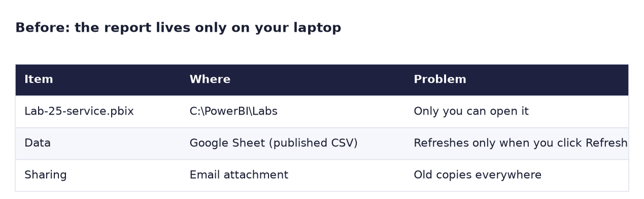
Before. The report exists only on your laptop.
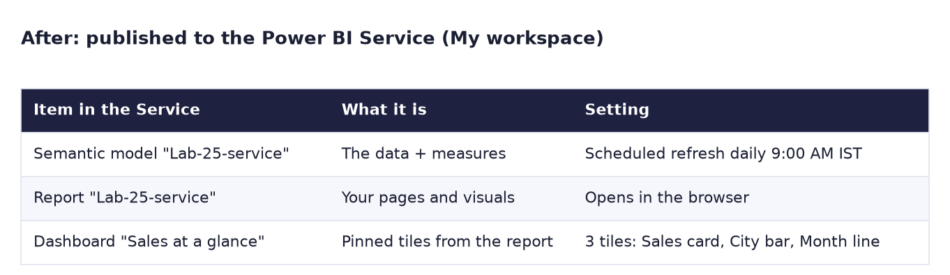
After. Three items in the Service: semantic model, report and dashboard, with a daily refresh.
The formula
The Source step of our query is a web address, which the Service can reach on its own:
= Csv.Document(Web.Contents("https://docs.google.com/spreadsheets/d/e/…/pub?gid=0&single=true&output=csv"), [Delimiter=",", Columns=7, Encoding=65001])
| Source | Can the Service refresh it alone? |
|---|---|
| Web link, SharePoint/OneDrive file, cloud database | Yes (set credentials once) |
C:\… file on your laptop, office SQL Server |
Only with a gateway running on that PC or network |
When you publish, Power BI creates two items: a semantic model (data + measures) and a report (pages). A dashboard is a third, separate item: one page of tiles pinned from one or more reports.
Steps
Part A: Desktop
- Create a new Google Sheet (
https://sheets.new), File → Import → Uploadpbi_sales.csv, choose Replace current sheet and untick Convert text to numbers, dates and formulas (so the dates stay as 2025-01-14 and are not changed to your Google locale). Name it pbi_sales (sample). - File → Share → Publish to web, choose the sheet and Comma-separated values (.csv), click Publish and copy the link (it ends with
output=csv). -
In Power BI Desktop: Get data → Web, paste the link, OK (Anonymous if asked), then Load.
What you should see: a table with 24 rows (rename the query to pbi_sales).
-
Add the measure
Total Sales = SUM ( pbi_sales[Sales] ). Build a Card (Total Sales), a Bar chart (City, Total Sales, sorted) and a Line chart (OrderDate by Month, Total Sales). - Save as
Lab-25-service. Click Sign in at the top right of Desktop and sign in with your work or school email.
Part B: publish and pin
-
Click Home → Publish, choose My workspace, click Select.
What you should see: "Success! Opening 'Lab-25-service.pbix' in Power BI" with a link. Click it.
-
In the browser report, hover over the Card and click the pin icon. Choose New dashboard, name it
Sales at a glance, click Pin. - Pin the bar chart and the line chart to the Existing dashboard "Sales at a glance".
-
In the left menu, open My workspace.
What you should see: three items: a Dashboard (Sales at a glance), a Report and a Semantic model, all called Lab-25-service except the dashboard.
Part C: credentials and schedule
- Hover over the semantic model, click … → Settings. Expand Data source credentials → Edit credentials. Choose Authentication method: Anonymous, Privacy level: Public (it is a published sample sheet), and click Sign in.
-
Expand Refresh (Scheduled refresh). Turn it On, frequency Daily, time zone (UTC+05:30) Chennai, Kolkata, Mumbai, New Delhi, click Add another time and choose 9:00 AM. Click Apply.
What you should see: "Next refresh" shows tomorrow at 9:00 AM.
-
Test it. In the Google Sheet, change order SO-1024's Sales from 100000 to 150000. Wait about 5 minutes (Google republishes).
-
In My workspace, hover over the semantic model and click the Refresh now icon. When it finishes, open the dashboard.
What you should see: the card tile shows 1.35M instead of 1.30M, and Nashik's bar is longer. Change the Sheet back to 100000 afterwards.
Ravindra Bagale's Tip
Report vs dashboard is a classic interview question. Report: many pages, built in Desktop, fully interactive, on one semantic model. Dashboard: one page in the Service only, made of tiles pinned from one or more reports; clicking a tile opens the report. Say it like that, with today's example. Fark lakshat theva!
Ravindra Bagale's Tip – मराठी
Report आणि dashboard मधला फरक हा classic interview प्रश्न आहे. Report: अनेक pages, Desktop मध्ये बनवलेला, पूर्ण interactive, एका semantic model वर. Dashboard: फक्त Service मधलं एक page, एक किंवा अनेक reports मधून pin केलेल्या tiles चं; tile वर click केलं की report उघडतो. आजच्या उदाहरणासकट असं सांगा. फरक लक्षात ठेवा!
Ravindra Bagale's Tip – हिंदी
Report और dashboard का फर्क एक classic interview सवाल है। Report: कई pages, Desktop में बना, पूरा interactive, एक semantic model पर। Dashboard: सिर्फ Service में एक page, एक या कई reports से pin किए tiles का; tile पर click करो तो report खुलता है। आज के उदाहरण के साथ ऐसे बताओ। फर्क याद रखो!
Common mistakes
| Mistake | What happens | Fix |
|---|---|---|
| Signing in with Gmail | "Enter a work or school email" | Use a work or school account |
Data from C:\…\pbi_sales.csv |
Scheduled refresh needs a gateway; setup fails without one | Use a cloud source (this lab), or install the personal gateway on your PC |
| Skipping Data source credentials | Refresh fails: "credentials are required" | Settings → Edit credentials → Anonymous |
| Time zone left as UTC | Refresh runs at 2:30 PM IST instead of 9 AM | Choose (UTC+05:30) Chennai, Kolkata, Mumbai, New Delhi |
| Expecting the dashboard tile to update without a refresh | Tile still shows the old number | Refresh the semantic model (now or on schedule) |
| Using Publish to web in the Service to "share" | The report becomes public to anyone on the internet | Never for company data; share properly with Pro/PPU licences |
Self-check checklist
0 of 5 done
Try-at-home challenge
Open the dashboard on your phone with the free Power BI mobile app (sign in with the same account). Which tile appears first, and how can you change the order for phone users?
Check your answer
The phone shows the tiles in a single column, roughly in their order from the top left. To control it, open the dashboard in the browser, click Edit → Mobile layout and drag the tiles: put the Total Sales card first. The report itself uses the phone layout you designed in Desktop (Lab 24); the dashboard has its own mobile layout in the Service.
Samjla ka? Publish creates a semantic model and a report; pinning builds a dashboard; credentials + schedule keep it fresh. Aata pudhe jaauya: row-level security, so each city manager sees only their city.