Labs · Power BI
Lab: Build and Format Five Core Visuals – Card, Bar, Line, Table and Matrix
Course: Power BI · Chapter 14: Visuals and Their Formatting
Chapter 14 covers visuals and their formatting; this lab builds the five you will use in almost every report.
Download pbi_sales.csv (24 orders) Download pbi_products.csv Download pbi_cities.csv
Chala mitrano! Power BI has more than 30 visuals, but in real jobs five of them do 90% of the work: card, bar, line, table and matrix. Learn these five properly, with clean titles and labels, and you can build almost any business report. Paach visual, poora report!
चला मित्रांनो! Power BI मध्ये 30 पेक्षा जास्त visuals आहेत, पण खऱ्या कामात त्यातले पाच 90% काम करतात: card, bar, line, table आणि matrix. हे पाच नीट शिका, clean titles आणि labels सकट, आणि तुम्ही जवळपास कोणताही business report बनवू शकता. पाच visual, पूर्ण report!
चलो दोस्तों! Power BI में 30 से ज़्यादा visuals हैं, लेकिन असली काम में उनमें से पाँच 90% काम करते हैं: card, bar, line, table और matrix। ये पाँच ठीक से सीखो, साफ titles और labels के साथ, और आप लगभग कोई भी business report बना सकते हो। पाँच visual, पूरा report!
Suppose we are…
Suppose we are a BI analyst at Croma, and the regional manager wants a first look at the 24 sample orders: "What are the totals? Which city sells most? Is 2026 better than 2025 month by month? Which product moves the most units? And give me city by year in one grid." Each question needs a different visual. The numbers are sample data made up for practice.
| Question | Best visual |
|---|---|
| What is the total? | Card |
| Which city is biggest? | Bar chart (sorted) |
| How does it change over time? | Line chart |
| Exact numbers for a few products | Table |
| Two categories at once (City × Year) | Matrix |
Goal of this lab
By the end you will have one report page with:
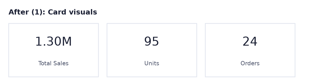
- 3 cards: Total Sales 1.30M, Units 95, Orders 24.
- A bar chart of Sales by City, sorted, with data labels.
- A line chart comparing 2025 and 2026 by month.
- A table of Units and Sales by Product.
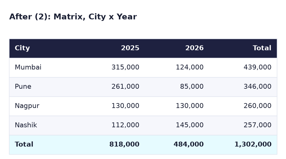
- A City × Year matrix with totals.
What you need (all free)
- Power BI Desktop and
Lab-11-star-schema.pbixfrom Lab 11 (it has the DateTable and Total Sales). No file? Build it first with these CSVs: - Download pbi_sales.csv (24 orders) Download pbi_products.csv Download pbi_cities.csv
- 40 minutes.
The data: before and after
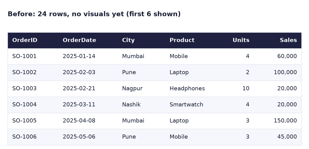
Before. Just rows. Nobody can answer the manager's questions by reading them.
After (1). Three cards answer "what are the totals?" in one glance.
After (2). The matrix answers City × Year with row and column totals.
The formula
Two small measures join the Total Sales measure from Lab 11:
Units  = SUM ( pbi_sales[Units] )
Orders = COUNTROWS ( pbi_sales )
COUNTROWS counts the rows of a table: one row per order, so 24. Always prefer measures in visuals over dragging raw columns: the name is clean ("Units", not "Sum of Units") and you can reuse it everywhere.
Steps
- Open
Lab-11-star-schema.pbixand File → Save asLab-14-five-visuals. Delete any visuals on the page. - Right-click pbi_sales → New measure:
Units = SUM ( pbi_sales[Units] ). Then another:Orders = COUNTROWS ( pbi_sales ). -
Cards. Click empty canvas, click the Card icon, add Total Sales. Make two more cards with Units and Orders. Line them up across the top.
What you should see: 1.30M, 95 and 24.
-
Bar chart. Click empty canvas → Clustered bar chart. Y-axis: pbi_cities[City], X-axis: Total Sales. Click the … (More options) on the visual → Sort axis → Total Sales and Sort descending.
-
Select the bar chart → Format visual → Visual → Data labels: On. Then General → Title → Text:
Sales by City.What you should see: Mumbai 439K, Pune 346K, Nagpur 260K, Nashik 257K, largest at the top.
-
Line chart. Click empty canvas → Line chart. X-axis: DateTable[Month], Y-axis: Total Sales, Legend: DateTable[Year]. Title:
Sales by Month, 2025 vs 2026.What you should see: two lines from January to December; the 2026 line stops at June. January: 60K (2025) vs 100K (2026).
-
Table. Click empty canvas → Table. Add pbi_products[Product], Units and Total Sales. Click the Units column header in the visual to sort by it.
What you should see: Headphones 36, Mobile 26, Smartwatch 18, Laptop 15 units; Total 95 and 1,302,000.
-
Matrix. Click empty canvas → Matrix. Rows: pbi_cities[City], Columns: DateTable[Year], Values: Total Sales.
What you should see: the same grid as the After (2) image, with totals 818,000, 484,000 and 1,302,000.
-
Consistent formatting. Select the bar chart, click Home → Format painter, then click the line chart. Repeat for the table and matrix. Then for each visual set General → Title → Font size to 14.
- Select each card → Format visual → Visual → Callout value and check display units: Total Sales on Auto (1.30M), Units and Orders on None.
- Save.
Ravindra Bagale's Tip
Choose the visual by the question, not by the colours. Comparing categories: bar. Change over time: line. One number: card. Exact values: table. Two categories: matrix. And avoid pie charts with more than 3 or 4 slices: eyes cannot compare angles well. Prashna aadhi, visual nantar!
Ravindra Bagale's Tip – मराठी
Visual प्रश्नावरून निवडा, रंगांवरून नाही. Categories ची तुलना: bar. वेळेनुसार बदल: line. एक number: card. अचूक values: table. दोन categories: matrix. आणि 3 किंवा 4 पेक्षा जास्त slices असलेले pie charts टाळा: डोळ्यांना कोनांची तुलना नीट जमत नाही. प्रश्न आधी, visual नंतर!
Ravindra Bagale's Tip – हिंदी
Visual सवाल देखकर चुनो, रंग देखकर नहीं। Categories की तुलना: bar। समय के साथ बदलाव: line। एक number: card। सटीक values: table। दो categories: matrix। और 3 या 4 से ज़्यादा slices वाले pie charts से बचो: आँखें कोणों की तुलना ठीक से नहीं कर पातीं। सवाल पहले, visual बाद में!
Common mistakes
| Mistake | What happens | Fix |
|---|---|---|
| Using pbi_sales[City] (hidden) instead of pbi_cities[City] | You cannot find it, or filters behave oddly | Use the dimension column |
| Line chart with Month sorted A–Z | April, August, December… | Sort Month by Month No (Lab 11, step 5) |
| Bar chart not sorted | The reader hunts for the biggest bar | … → Sort axis → Total Sales, descending |
| Card shows "Sum of Units" as label | Looks unfinished | Use the Units measure, or rename the field in the visual |
| A different font and colour on every visual | The page looks messy | Use Format painter |
| Matrix without the Columns field | It looks like a plain table | Put Year in Columns |
Self-check checklist
0 of 6 done
Try-at-home challenge
Add one more measure, Avg Order Value = Total Sales ÷ Orders, show it as a fourth card, and find which city has the highest average order value using a table.
Check your answer
Avg Order Value = DIVIDE ( [Total Sales], [Orders] )The card shows 54.25K (1,302,000 ÷ 24). In a table with City and Avg Order Value: Mumbai 73,167, Pune 57,667, Nagpur 43,333, Nashik 42,833. Every city has 6 orders, so Mumbai has the most sales and the biggest average basket.
Samjla ka? Card for a number, bar to compare, line for time, table for detail, matrix for two categories. Aata pudhe jaauya: put Maharashtra on a map and fix the wrong locations.