Labs · Power BI
Lab: Pick a Project Brief and Write Its KPI List, Data-Model Sketch and Page Plan
Course: Power BI · Chapter 35: More Real-World Project Briefs
Chapter 35 has more real-world project briefs; this lab shows how to turn any brief into a plan you can build.
Chala mitrano! The most expensive mistake in a project is building the wrong thing well. A client says three sentences; we must turn them into KPIs with exact definitions, a model and a page plan, and show it to them before we build. Today we do that for a hospital. Aadhi plan, mag Power BI!
चला मित्रांनो! Project मधली सगळ्यात महाग चूक म्हणजे चुकीची गोष्ट छान बनवणे. Client तीन वाक्यं बोलतो; आपल्याला त्यांचे exact definitions असलेले KPIs, model आणि page plan बनवायचे आणि build करण्याआधी त्यांना दाखवायचे. आज hospital साठी हे करू. आधी plan, मग Power BI!
चलो दोस्तों! Project की सबसे महंगी गलती है गलत चीज़ को अच्छे से बनाना। Client तीन वाक्य बोलता है; हमें उन्हें exact definitions वाले KPIs, model और page plan में बदलना है, और बनाने से पहले उन्हें दिखाना है। आज यह एक hospital के लिए करेंगे। पहले plan, फिर Power BI!
Suppose we are…
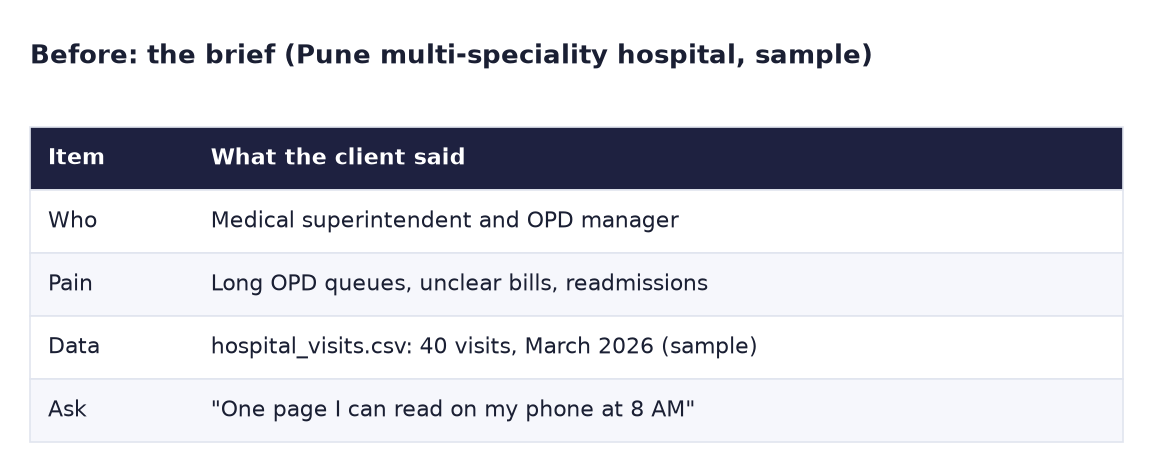
Suppose we are a freelance Power BI developer and a multi-speciality hospital in Pune (similar to Ruby Hall Clinic or Jehangir Hospital) calls us. The medical superintendent says: "OPD queues are long, patients complain about bills, and too many patients come back within a month. I want one page I can read on my phone at 8 AM." They send hospital_visits.csv: 40 visits from March 2026. All data is sample data made up for practice.
Goal of this lab
Produce a one-page plan with four parts:
- A KPI list with exact definitions (4 KPIs).
- A data-model sketch (star schema).
- A page plan (2 pages + phone layout).
- A data-gap list: questions for the client.
What you need (all free)
- Paper and pen, or Google Docs (and draw.io for the sketch).
- Download hospital_visits.csv (40 visits, March 2026) (to check which columns really exist).
- 40 minutes.
The data: before and after
Before. The brief: who, pain, data and ask, in the client's words.
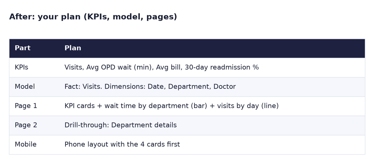
After. Your plan: KPIs, model, pages, mobile.
The formula
Every KPI gets one row in this template. A KPI without a written definition causes arguments later.
| KPI | Exact definition | Formula idea | Good direction | Pain it answers |
|---|---|---|---|---|
| Visits | Count of rows (OPD + IPD) | COUNTROWS ( Visits ) |
– | Workload |
| Avg OPD wait (min) | Average WaitMins, OPD only (IPD rows are blank) | AVERAGE ( Visits[WaitMins] ) |
Down | Long queues |
| Avg bill (Rs) | Average Bill over all visits | AVERAGE ( Visits[Bill] ) |
– (watch by type) | Unclear bills |
| 30-day readmission % | Visits with Readmitted30d = "Yes" ÷ all visits | DIVIDE ( readmitted, visits ) |
Down | Patients coming back |
Steps
- Read the brief image twice. Underline the three pains and the one ask.
-
Open
hospital_visits.csv(in Google Sheets or Excel) and list the columns.What you should see: 40 rows and 7 columns: VisitID, VisitDate, Department, PatientType, WaitMins, Bill, Readmitted30d. WaitMins is empty for IPD rows.
-
KPI list. Copy the template above and fill it in your own words. For each KPI, write which pain it answers. If a KPI answers no pain, drop it.
-
Data-model sketch. Draw one box in the middle: Visits (fact: one row per visit). Draw boxes around it: Date (from VisitDate), Department, and Doctor. Draw "1 → *" lines from each dimension to Visits.
What you should see: a star with Visits in the centre. Note that Doctor is in your sketch but not in the file: that goes on the data-gap list.
-
Page plan. Sketch two rectangles:
- Page 1 "8 AM view": a row of 4 KPI cards at the top, a bar chart "Avg OPD wait by department", a line chart "Visits by day", and a Department slicer.
- Page 2 "Department details": a drill-through page with the department's visits table, bills by patient type and readmissions.
-
Phone layout. Draw a tall phone outline: 4 cards first (2 × 2), then the wait-time bar. Nothing else: "readable at 8 AM".
-
Data-gap list. Write at least 4 questions for the client, for example:
- Can we get a Doctor column (or a doctor list with DoctorID)?
- Is "wait" measured from registration to consultation, or from appointment time?
- Should the readmission % count IPD only or all visits?
- What target do you want for OPD wait (for example 30 minutes)?
-
Put everything on one page (photo of the paper or a Google Doc). That is the document you send the client before building.
What you should see: one page with 4 KPIs, a star sketch, 2 page sketches + phone, and 4 or more questions.
Ravindra Bagale's Tip
The data-gap list is what makes you look senior. Juniors build with whatever is in the file; seniors say "you asked about doctors, but the file has no doctor column; can you send it?" Asking on day 1 costs one email; finding it on day 10 costs a rebuild. Prashna aadhi vichara!
Ravindra Bagale's Tip – मराठी
Data-gap list मुळे तुम्ही senior दिसता. Juniors file मध्ये जे आहे त्यावर build करतात; seniors म्हणतात "तुम्ही doctors बद्दल विचारलंत, पण file मध्ये doctor column नाही; पाठवू शकाल का?" पहिल्या दिवशी विचारलं तर एक email; दहाव्या दिवशी कळलं तर पूर्ण rebuild. प्रश्न आधी विचारा!
Ravindra Bagale's Tip – हिंदी
Data-gap list से आप senior लगते हो। Juniors file में जो है उसी से build करते हैं; seniors कहते हैं "आपने doctors के बारे में पूछा, पर file में doctor column नहीं है; भेज सकते हो?" पहले दिन पूछो तो एक email; दसवें दिन पता चले तो पूरा rebuild। सवाल पहले पूछो!
Other briefs from Chapter 35
The same four parts work for any brief. Try one more: a school (attendance %, average marks, fee collection %, dropouts) or a retail store (sales, footfall, conversion %, average bill). Different KPIs, same plan.
Common mistakes
| Mistake | What happens | Fix |
|---|---|---|
| KPI with no definition ("Wait time") | Client and developer calculate it differently | Write the exact rule, e.g. "OPD only, minutes" |
| Averaging WaitMins over IPD rows as 0 | Average wait looks too low | Blank, not 0, for IPD; or filter OPD |
| One flat table, no model | Hard to add Doctor or targets later | Sketch the star now |
| 12 visuals on the 8 AM page | The superintendent reads nothing | 4 cards + 2 visuals |
| Building before the client agrees | Rework | Send the one-page plan first |
Self-check checklist
0 of 5 done
Try-at-home challenge
The client replies: "Bills: show me whether IPD is driving the average." Without building anything, predict: is the average bill for all visits much higher than the average OPD bill? Then check with the CSV in a spreadsheet (AVERAGE and AVERAGEIF).
Check your answer
Yes. IPD bills are about 10 times an OPD bill in this sample, so 5 IPD visits pull the average up a lot. In the CSV: =AVERAGE(F2:F41) gives 3,648.75 for all 40 visits, while =AVERAGEIF(D2:D41,"OPD",F2:F41) gives the OPD-only average of 1,667.14, and the IPD average is 17,520. So the plan should show Avg bill split by PatientType (OPD vs IPD), not one number. Add that to Page 2 and to your KPI definition.
Samjla ka? Pains → KPIs with definitions → star sketch → pages → questions for the client. Aata pudhe jaauya: build the 4-KPI card row for this hospital.