Industry Dashboards in Power BI: 10 Practice Reports
Ten Power BI practice reports, one per industry: banking, hospitals, retail, education, logistics, hotels, pharma, real estate, restaurants and telecom. For each one you download an Excel data file, load its table in Power BI Desktop, and build the same cards and charts as the matching Excel dashboard. The loading steps are the same for all ten, so they are written once below. The pictures are teaching mockups drawn for class, not screenshots from Power BI Desktop. There is no PBIX file to download. All numbers in these workbooks are fictional teaching data, not real company figures.
Quick answer
Get data from the Excel table in the workbook (not the whole sheet). Add the cards first, then the six charts listed for your industry below and on the workbook's Report plan sheet.
The 10 dashboards
- Banking (xlsx)
- Education (xlsx)
- Hospitals (xlsx)
- Hotels (xlsx)
- Logistics (xlsx)
- Pharma (xlsx)
- Real Estate (xlsx)
- Restaurants (xlsx)
- Retail (xlsx)
- Telecom (xlsx)
Steps that are the same for every dashboard
Build the report
- Download the workbook with the link on this page.
- Open Power BI Desktop on your computer.
- On the Home tab, click Get data, then Excel workbook.
- Choose the workbook and click Open.
- Tick the data table. Do not tick the whole sheet. Click Load.
- Open the Report plan sheet in Excel if you want the field list beside you.
- If Month sorts as plain text, sort the axis as Apr, May, Jun, Jul, Aug, Sep, Oct, Nov, Dec, Jan, Feb, Mar.
- Look at the picture on this page. It is a teaching mockup, not a screenshot from Power BI Desktop.
Banking
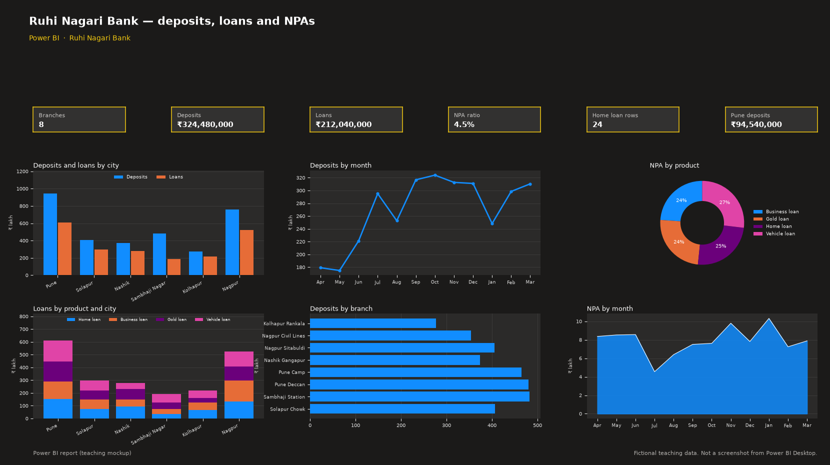
This page is a classroom practice for Ruhi Nagari Bank. You download an Excel file, load it in Power BI, and build the same cards and charts as the Excel dashboard. All numbers in this workbook are fictional teaching data, not real company figures.
Download Banking_PowerBI_Data.xlsx. Your browser will download this Excel file. It does not open as a web page. There is no PBIX file to download. You build the report in Power BI Desktop.
Build the report
- Add a Card for Branches. Card. Drag Branch. Summary: Count (Distinct). The teaching data shows 8.
- Add a Card for Deposits. Card. Drag Deposits. Summary: Sum. The teaching data shows ₹324,480,000.
- Add a Card for Loans. Card. Drag Loans. Summary: Sum. The teaching data shows ₹212,040,000.
- Add a Card for NPA ratio. Card. New measure: DIVIDE(SUM(NPA), SUM(Loans)). The teaching data shows 4.5%.
- Add a Card for Home loan rows. Card. Drag Product. Summary: Count. Filter Product is Home loan. The teaching data shows 24.
- Add a Card for Pune deposits. Card. Drag Deposits. Summary: Sum. Filter City is Pune. The teaching data shows ₹94,540,000.
- Add a Clustered column chart named Deposits and loans by city. X-axis: City. Y-axis: Sum of Deposits and Sum of Loans.
- Add a Line chart named Deposits by month. X-axis: Month. Y-axis: Sum of Deposits.
- Add a Doughnut chart named NPA by product. Legend: Product. Values: Sum of NPA.
- Add a Stacked column chart named Loans by product and city. X-axis: City. Legend: Product. Y-axis: Sum of Loans.
- Add a Clustered bar chart named Deposits by branch. Y-axis: Branch. X-axis: Sum of Deposits.
- Add an Area chart named NPA by month. X-axis: Month. Y-axis: Sum of NPA.
Ravindra Bagale's Tip
Load the named Excel table, not the whole sheet. The first row of the sheet is a note, not a data row. If that note lands in your model, the cards will be wrong.
What you will see
The cards read the same fictional rows as the Excel dashboard: Branches 8, Deposits ₹324,480,000, Loans ₹212,040,000, NPA ratio 4.5%, Home loan rows 24, Pune deposits ₹94,540,000.
The dashboard has six charts: a clustered column of deposits and loans by city, a line of monthly deposits, a doughnut of NPA by product, a stacked column of loans by product and city, a bar chart of branches, and an area chart of monthly NPA.
Learn it properly
Course lesson:
Education
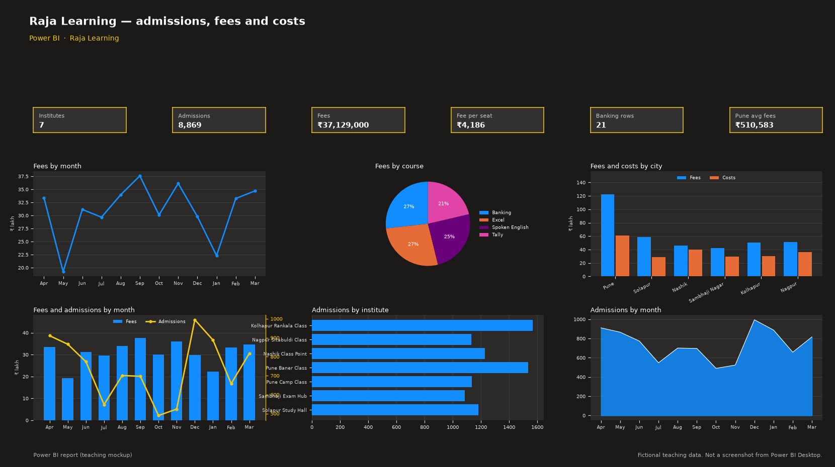
This page is a classroom practice for Raja Learning. You download an Excel file, load it in Power BI, and build the same cards and charts as the Excel dashboard. All numbers in this workbook are fictional teaching data, not real company figures.
Download Education_PowerBI_Data.xlsx. Your browser will download this Excel file. It does not open as a web page. There is no PBIX file to download. You build the report in Power BI Desktop.
Build the report
- Add a Card for Institutes. Card. Drag Institute. Summary: Count (Distinct). The teaching data shows 7.
- Add a Card for Admissions. Card. Drag Admissions. Summary: Sum. The teaching data shows 8,869.
- Add a Card for Fees. Card. Drag Fees. Summary: Sum. The teaching data shows ₹37,129,000.
- Add a Card for Fee per seat. Card. New measure: DIVIDE(SUM(Fees), SUM(Admissions)). The teaching data shows ₹4,186.
- Add a Card for Banking rows. Card. Drag Course. Summary: Count. Filter Course is Banking. The teaching data shows 21.
- Add a Card for Pune avg fees. Card. Drag Fees. Summary: Average. Filter City is Pune. The teaching data shows ₹510,583.
- Add a Line chart named Fees by month. X-axis: Month. Y-axis: Sum of Fees.
- Add a Pie chart named Fees by course. Legend: Course. Values: Sum of Fees.
- Add a Clustered column chart named Fees and costs by city. X-axis: City. Y-axis: Sum of Fees and Sum of Costs.
- Add a Line and clustered column chart named Fees and admissions by month. X-axis: Month. Column Y-axis: Sum of Fees. Line Y-axis on the secondary axis: Sum of Admissions.
- Add a Clustered bar chart named Admissions by institute. Y-axis: Institute. X-axis: Sum of Admissions.
- Add an Area chart named Admissions by month. X-axis: Month. Y-axis: Sum of Admissions.
What you will see
The cards read the same fictional rows as the Excel dashboard: Institutes 7, Admissions 8,869, Fees ₹37,129,000, Fee per seat ₹4,186, Banking rows 21, Pune avg fees ₹510,583.
The dashboard has six charts: a line of monthly fees, a pie of fees by course, a clustered column of fees and costs by city, a combo of fees and admissions, a bar chart of institutes, and an area chart of monthly admissions.
Hospitals
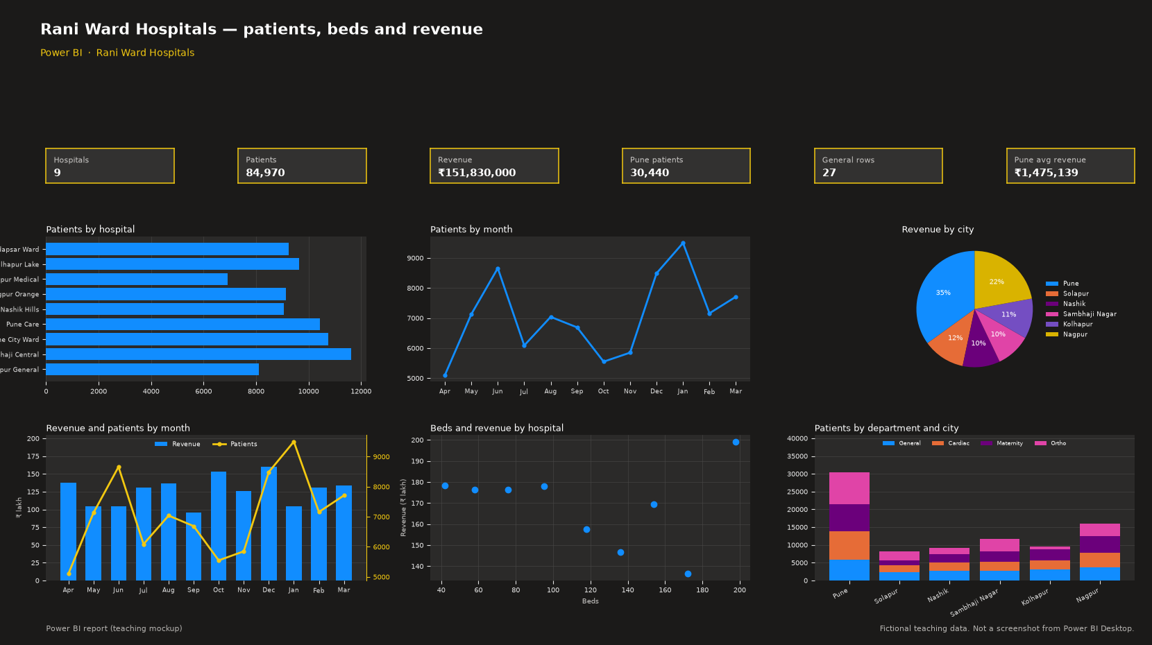
This page is a classroom practice for Rani Ward Hospitals. You download an Excel file, load it in Power BI, and build the same cards and charts as the Excel dashboard. All numbers in this workbook are fictional teaching data, not real company figures.
Download Hospitals_PowerBI_Data.xlsx. Your browser will download this Excel file. It does not open as a web page. There is no PBIX file to download. You build the report in Power BI Desktop.
Build the report
- Add a Card for Hospitals. Card. Drag Hospital. Summary: Count (Distinct). The teaching data shows 9.
- Add a Card for Patients. Card. Drag Patients. Summary: Sum. The teaching data shows 84,970.
- Add a Card for Revenue. Card. Drag Revenue. Summary: Sum. The teaching data shows ₹151,830,000.
- Add a Card for Pune patients. Card. Drag Patients. Summary: Sum. Filter City is Pune. The teaching data shows 30,440.
- Add a Card for General rows. Card. Drag Department. Summary: Count. Filter Department is General. The teaching data shows 27.
- Add a Card for Pune avg revenue. Card. Drag Revenue. Summary: Average. Filter City is Pune. The teaching data shows ₹1,475,139.
- Add a Clustered bar chart named Patients by hospital. Y-axis: Hospital. X-axis: Sum of Patients.
- Add a Line chart named Patients by month. X-axis: Month. Y-axis: Sum of Patients.
- Add a Pie chart named Revenue by city. Legend: City. Values: Sum of Revenue.
- Add a Line and clustered column chart named Revenue and patients by month. X-axis: Month. Column Y-axis: Sum of Revenue. Line Y-axis on the secondary axis: Sum of Patients.
- Add a Scatter chart named Beds and revenue by hospital. Details: Hospital. X Axis: Average of Beds. Y Axis: Sum of Revenue.
- Add a Stacked column chart named Patients by department and city. X-axis: City. Legend: Department. Y-axis: Sum of Patients.
What you will see
The cards read the same fictional rows as the Excel dashboard: Hospitals 9, Patients 84,970, Revenue ₹151,830,000, Pune patients 30,440, General rows 27, Pune avg revenue ₹1,475,139.
The dashboard has six charts: a bar chart of patients by hospital, a line of monthly patients, a pie of revenue by city, a combo of revenue and patients by month, a scatter of beds against revenue, and a stacked column of patients by department and city.
Hotels
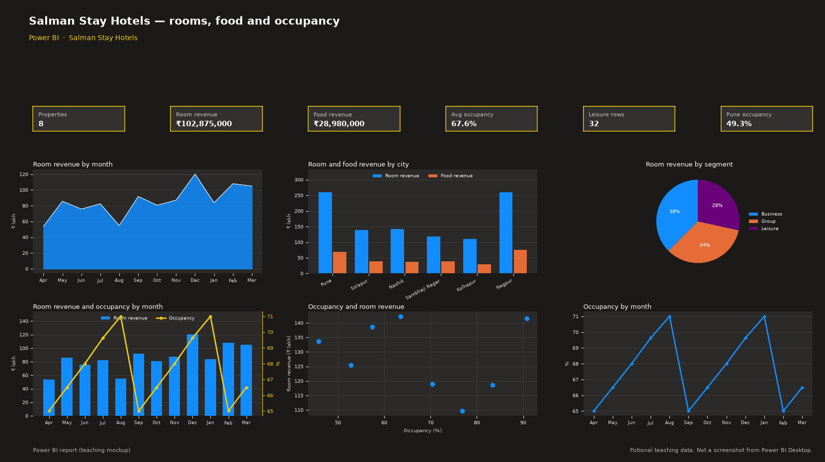
This page is a classroom practice for Salman Stay Hotels. You download an Excel file, load it in Power BI, and build the same cards and charts as the Excel dashboard. All numbers in this workbook are fictional teaching data, not real company figures.
Download Hotels_PowerBI_Data.xlsx. Your browser will download this Excel file. It does not open as a web page. There is no PBIX file to download. You build the report in Power BI Desktop.
Build the report
- Add a Card for Properties. Card. Drag Property. Summary: Count (Distinct). The teaching data shows 8.
- Add a Card for Room revenue. Card. Drag Room revenue. Summary: Sum. The teaching data shows ₹102,875,000.
- Add a Card for Food revenue. Card. Drag Food revenue. Summary: Sum. The teaching data shows ₹28,980,000.
- Add a Card for Avg occupancy. Card. Drag Occupancy. Summary: Average. The teaching data shows 67.6%.
- Add a Card for Leisure rows. Card. Drag Segment. Summary: Count. Filter Segment is Leisure. The teaching data shows 32.
- Add a Card for Pune occupancy. Card. Drag Occupancy. Summary: Average. Filter City is Pune. The teaching data shows 49.3%.
- Add an Area chart named Room revenue by month. X-axis: Month. Y-axis: Sum of Room revenue.
- Add a Clustered column chart named Room and food revenue by city. X-axis: City. Y-axis: Sum of Room revenue and Sum of Food revenue.
- Add a Pie chart named Room revenue by segment. Legend: Segment. Values: Sum of Room revenue.
- Add a Line and clustered column chart named Room revenue and occupancy by month. X-axis: Month. Column Y-axis: Sum of Room revenue. Line Y-axis on the secondary axis: Average of Occupancy.
- Add a Scatter chart named Occupancy and room revenue. Details: Property. X Axis: Average of Occupancy. Y Axis: Sum of Room revenue.
- Add a Line chart named Occupancy by month. X-axis: Month. Y-axis: Average of Occupancy.
What you will see
The cards read the same fictional rows as the Excel dashboard: Properties 8, Room revenue ₹102,875,000, Food revenue ₹28,980,000, Avg occupancy 67.6%, Leisure rows 32, Pune occupancy 49.3%.
The dashboard has six charts: an area chart of monthly room revenue, a clustered column of room and food revenue by city, a pie of room revenue by segment, a combo of room revenue and occupancy, a scatter of occupancy against room revenue, and a line of monthly occupancy.
Logistics
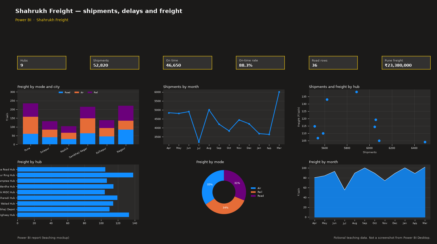
This page is a classroom practice for Shahrukh Freight. You download an Excel file, load it in Power BI, and build the same cards and charts as the Excel dashboard. All numbers in this workbook are fictional teaching data, not real company figures.
Download Logistics_PowerBI_Data.xlsx. Your browser will download this Excel file. It does not open as a web page. There is no PBIX file to download. You build the report in Power BI Desktop.
Build the report
- Add a Card for Hubs. Card. Drag Hub. Summary: Count (Distinct). The teaching data shows 9.
- Add a Card for Shipments. Card. Drag Shipments. Summary: Sum. The teaching data shows 52,820.
- Add a Card for On time. Card. Drag On time. Summary: Sum. The teaching data shows 46,650.
- Add a Card for On-time rate. Card. New measure: DIVIDE(SUM(On time), SUM(Shipments)). The teaching data shows 88.3%.
- Add a Card for Road rows. Card. Drag Mode. Summary: Count. Filter Mode is Road. The teaching data shows 36.
- Add a Card for Pune freight. Card. Drag Freight. Summary: Sum. Filter City is Pune. The teaching data shows ₹23,380,000.
- Add a Stacked column chart named Freight by mode and city. X-axis: City. Legend: Mode. Y-axis: Sum of Freight.
- Add a Line chart named Shipments by month. X-axis: Month. Y-axis: Sum of Shipments.
- Add a Scatter chart named Shipments and freight by hub. Details: Hub. X Axis: Sum of Shipments. Y Axis: Sum of Freight.
- Add a Clustered bar chart named Freight by hub. Y-axis: Hub. X-axis: Sum of Freight.
- Add a Doughnut chart named Freight by mode. Legend: Mode. Values: Sum of Freight.
- Add an Area chart named Freight by month. X-axis: Month. Y-axis: Sum of Freight.
What you will see
The cards read the same fictional rows as the Excel dashboard: Hubs 9, Shipments 52,820, On time 46,650, On-time rate 88.3%, Road rows 36, Pune freight ₹23,380,000.
The dashboard has six charts: a stacked column of freight by mode and city, a line of monthly shipments, a scatter of shipments against freight, a bar chart of hubs, a doughnut of freight by mode, and an area chart of monthly freight.
Pharma
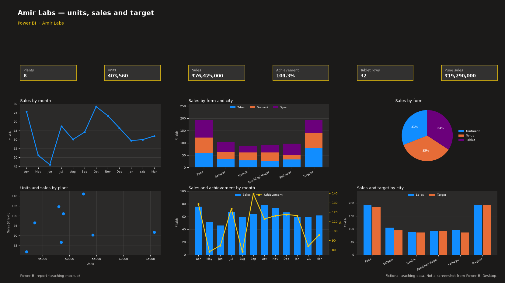
This page is a classroom practice for Amir Labs. You download an Excel file, load it in Power BI, and build the same cards and charts as the Excel dashboard. All numbers in this workbook are fictional teaching data, not real company figures.
Download Pharma_PowerBI_Data.xlsx. Your browser will download this Excel file. It does not open as a web page. There is no PBIX file to download. You build the report in Power BI Desktop.
Build the report
- Add a Card for Plants. Card. Drag Plant. Summary: Count (Distinct). The teaching data shows 8.
- Add a Card for Units. Card. Drag Units. Summary: Sum. The teaching data shows 403,560.
- Add a Card for Sales. Card. Drag Sales. Summary: Sum. The teaching data shows ₹76,425,000.
- Add a Card for Achievement. Card. New measure: DIVIDE(SUM(Sales), SUM(Target)). The teaching data shows 104.3%.
- Add a Card for Tablet rows. Card. Drag Form. Summary: Count. Filter Form is Tablet. The teaching data shows 32.
- Add a Card for Pune sales. Card. Drag Sales. Summary: Sum. Filter City is Pune. The teaching data shows ₹19,290,000.
- Add a Line chart named Sales by month. X-axis: Month. Y-axis: Sum of Sales.
- Add a Stacked column chart named Sales by form and city. X-axis: City. Legend: Form. Y-axis: Sum of Sales.
- Add a Pie chart named Sales by form. Legend: Form. Values: Sum of Sales.
- Add a Scatter chart named Units and sales by plant. Details: Plant. X Axis: Sum of Units. Y Axis: Sum of Sales.
- Add a Line and clustered column chart named Sales and achievement by month. X-axis: Month. Column Y-axis: Sum of Sales. Line Y-axis on the secondary axis: Achievement, which is Sum of Sales divided by Sum of Target.
- Add a Clustered column chart named Sales and target by city. X-axis: City. Y-axis: Sum of Sales and Sum of Target.
What you will see
The cards read the same fictional rows as the Excel dashboard: Plants 8, Units 403,560, Sales ₹76,425,000, Achievement 104.3%, Tablet rows 32, Pune sales ₹19,290,000.
The dashboard has six charts: a line of monthly sales, a stacked column of sales by form and city, a pie of sales by form, a scatter of units against sales, a combo of sales and achievement, and a clustered column of sales and target by city.
Real Estate
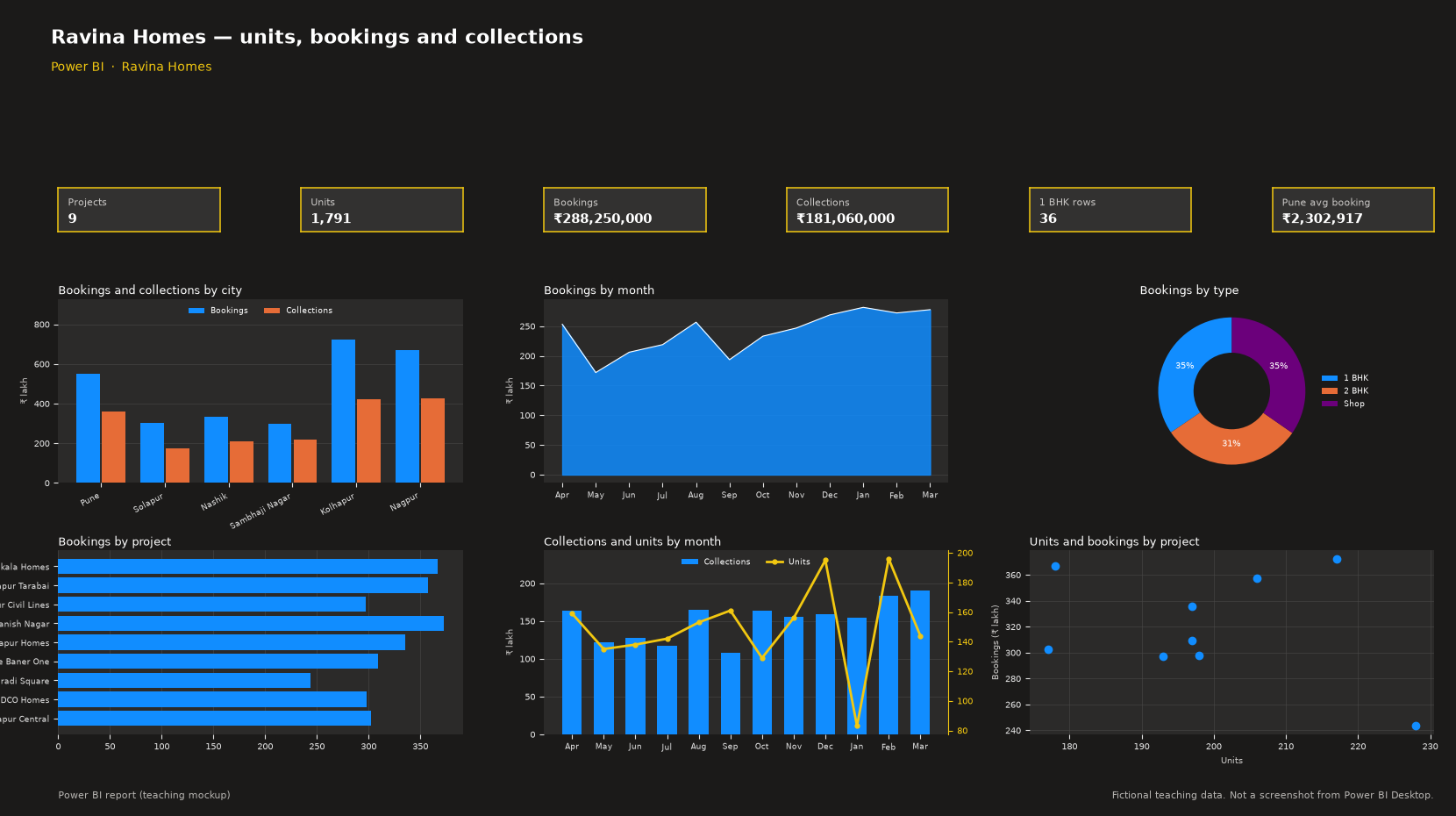
This page is a classroom practice for Ravina Homes. You download an Excel file, load it in Power BI, and build the same cards and charts as the Excel dashboard. All numbers in this workbook are fictional teaching data, not real company figures.
Download Real_Estate_PowerBI_Data.xlsx. Your browser will download this Excel file. It does not open as a web page. There is no PBIX file to download. You build the report in Power BI Desktop.
Build the report
- Add a Card for Projects. Card. Drag Project. Summary: Count (Distinct). The teaching data shows 9.
- Add a Card for Units. Card. Drag Units. Summary: Sum. The teaching data shows 1,791.
- Add a Card for Bookings. Card. Drag Bookings. Summary: Sum. The teaching data shows ₹288,250,000.
- Add a Card for Collections. Card. Drag Collections. Summary: Sum. The teaching data shows ₹181,060,000.
- Add a Card for 1 BHK rows. Card. Drag Type. Summary: Count. Filter Type is 1 BHK. The teaching data shows 36.
- Add a Card for Pune avg booking. Card. Drag Bookings. Summary: Average. Filter City is Pune. The teaching data shows ₹2,302,917.
- Add a Clustered column chart named Bookings and collections by city. X-axis: City. Y-axis: Sum of Bookings and Sum of Collections.
- Add an Area chart named Bookings by month. X-axis: Month. Y-axis: Sum of Bookings.
- Add a Doughnut chart named Bookings by type. Legend: Type. Values: Sum of Bookings.
- Add a Clustered bar chart named Bookings by project. Y-axis: Project. X-axis: Sum of Bookings.
- Add a Line and clustered column chart named Collections and units by month. X-axis: Month. Column Y-axis: Sum of Collections. Line Y-axis on the secondary axis: Sum of Units.
- Add a Scatter chart named Units and bookings by project. Details: Project. X Axis: Sum of Units. Y Axis: Sum of Bookings.
What you will see
The cards read the same fictional rows as the Excel dashboard: Projects 9, Units 1,791, Bookings ₹288,250,000, Collections ₹181,060,000, 1 BHK rows 36, Pune avg booking ₹2,302,917.
The dashboard has six charts: a clustered column of bookings and collections by city, an area chart of monthly bookings, a doughnut of bookings by type, a bar chart of projects, a combo of collections and units, and a scatter of units against bookings.
Restaurants
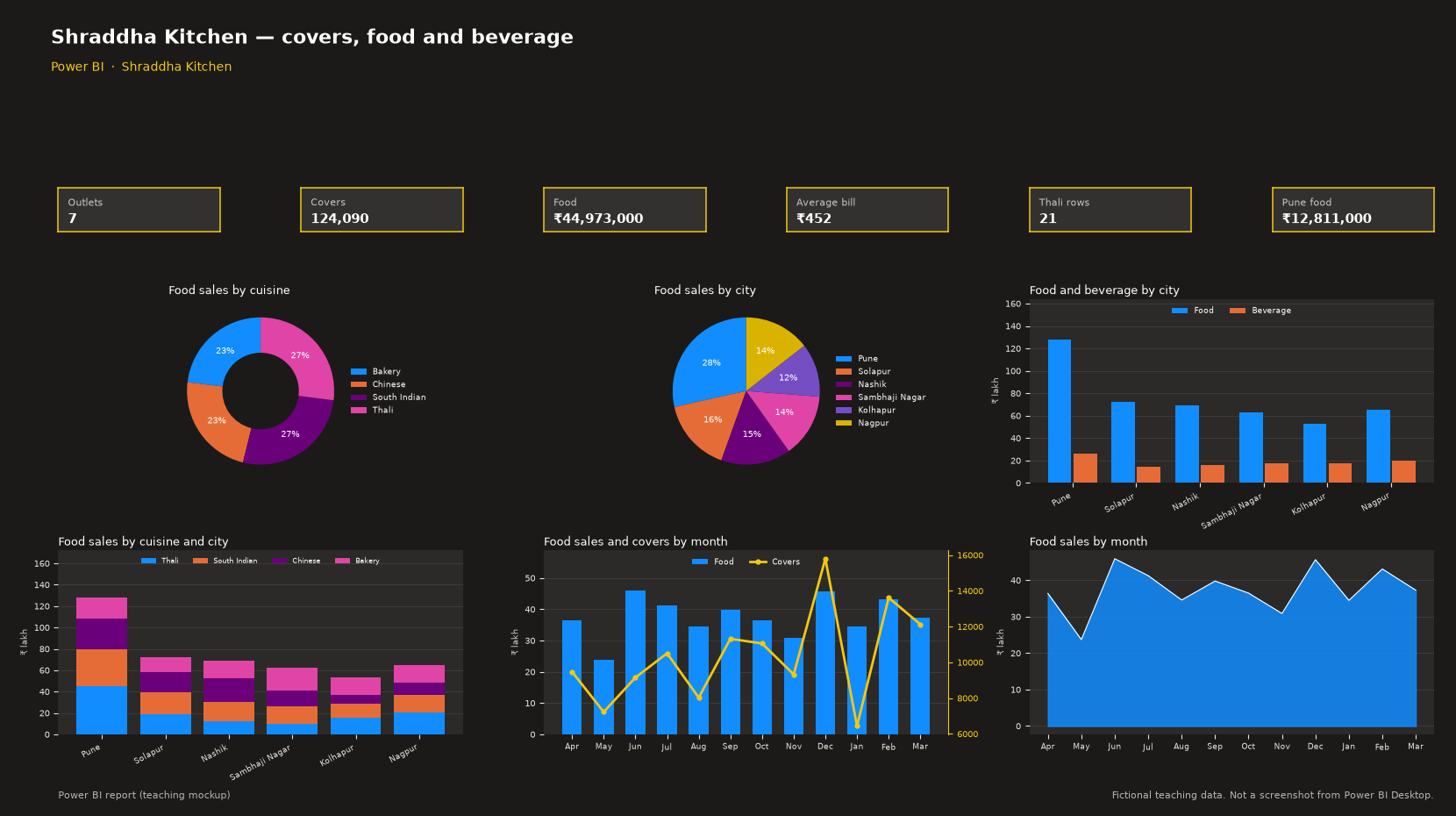
This page is a classroom practice for Shraddha Kitchen. You download an Excel file, load it in Power BI, and build the same cards and charts as the Excel dashboard. All numbers in this workbook are fictional teaching data, not real company figures.
Download Restaurants_PowerBI_Data.xlsx. Your browser will download this Excel file. It does not open as a web page. There is no PBIX file to download. You build the report in Power BI Desktop.
Build the report
- Add a Card for Outlets. Card. Drag Outlet. Summary: Count (Distinct). The teaching data shows 7.
- Add a Card for Covers. Card. Drag Covers. Summary: Sum. The teaching data shows 124,090.
- Add a Card for Food. Card. Drag Food. Summary: Sum. The teaching data shows ₹44,973,000.
- Add a Card for Average bill. Card. New measure: DIVIDE(SUM(Food) + SUM(Beverage), SUM(Covers)). The teaching data shows ₹452.
- Add a Card for Thali rows. Card. Drag Cuisine. Summary: Count. Filter Cuisine is Thali. The teaching data shows 21.
- Add a Card for Pune food. Card. Drag Food. Summary: Sum. Filter City is Pune. The teaching data shows ₹12,811,000.
- Add a Doughnut chart named Food sales by cuisine. Legend: Cuisine. Values: Sum of Food.
- Add a Pie chart named Food sales by city. Legend: City. Values: Sum of Food.
- Add a Clustered column chart named Food and beverage by city. X-axis: City. Y-axis: Sum of Food and Sum of Beverage.
- Add a Stacked column chart named Food sales by cuisine and city. X-axis: City. Legend: Cuisine. Y-axis: Sum of Food.
- Add a Line and clustered column chart named Food sales and covers by month. X-axis: Month. Column Y-axis: Sum of Food. Line Y-axis on the secondary axis: Sum of Covers.
- Add an Area chart named Food sales by month. X-axis: Month. Y-axis: Sum of Food.
What you will see
The cards read the same fictional rows as the Excel dashboard: Outlets 7, Covers 124,090, Food ₹44,973,000, Average bill ₹452, Thali rows 21, Pune food ₹12,811,000.
The dashboard has six charts: a doughnut of food sales by cuisine, a pie of food sales by city, a clustered column of food and beverage by city, a stacked column of food sales by cuisine and city, a combo of food sales and covers, and an area chart of monthly food sales.
Retail
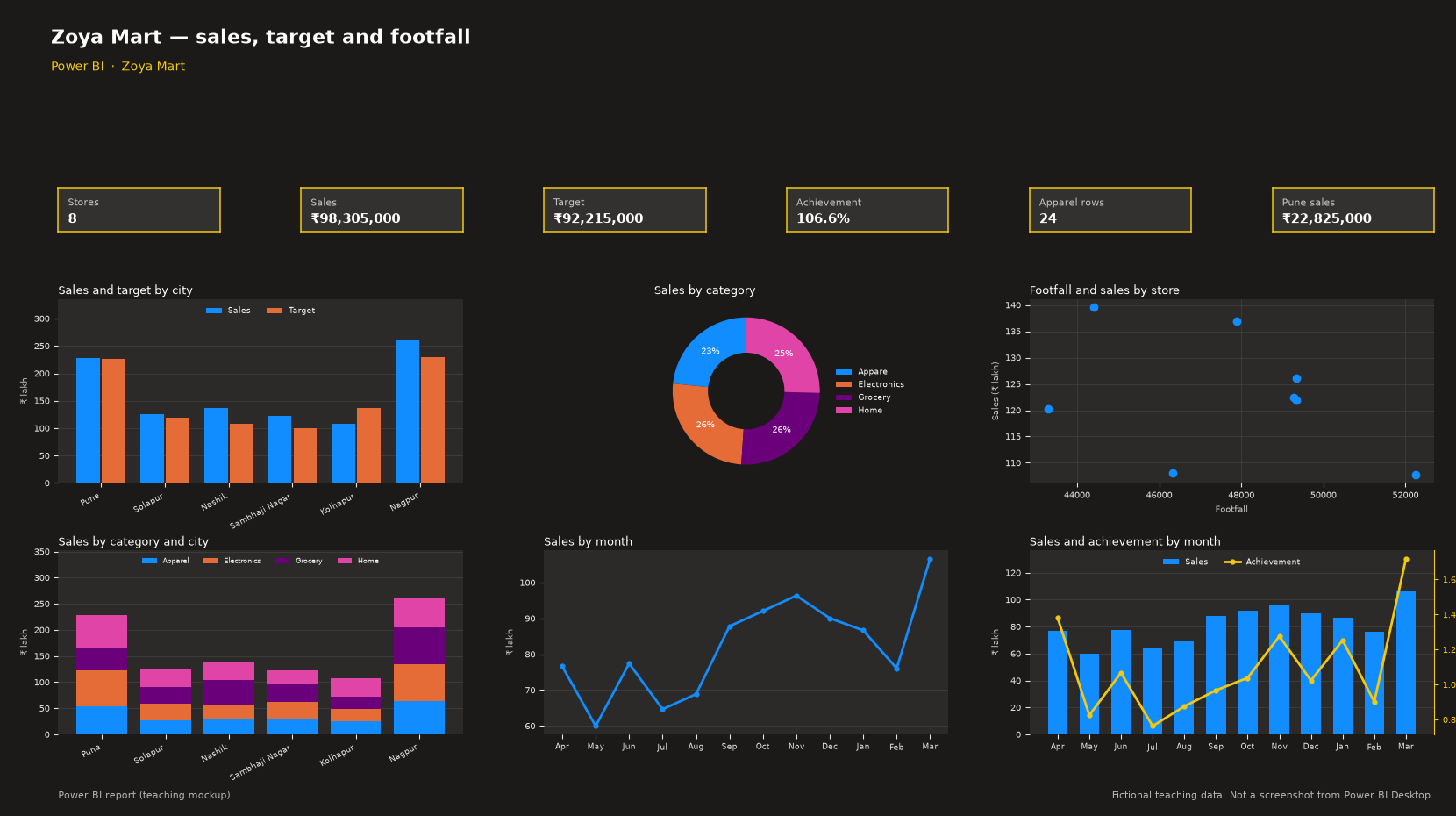
This page is a classroom practice for Zoya Mart. You download an Excel file, load it in Power BI, and build the same cards and charts as the Excel dashboard. All numbers in this workbook are fictional teaching data, not real company figures.
Download Retail_PowerBI_Data.xlsx. Your browser will download this Excel file. It does not open as a web page. There is no PBIX file to download. You build the report in Power BI Desktop.
Build the report
- Add a Card for Stores. Card. Drag Store. Summary: Count (Distinct). The teaching data shows 8.
- Add a Card for Sales. Card. Drag Sales. Summary: Sum. The teaching data shows ₹98,305,000.
- Add a Card for Target. Card. Drag Target. Summary: Sum. The teaching data shows ₹92,215,000.
- Add a Card for Achievement. Card. New measure: DIVIDE(SUM(Sales), SUM(Target)). The teaching data shows 106.6%.
- Add a Card for Apparel rows. Card. Drag Category. Summary: Count. Filter Category is Apparel. The teaching data shows 24.
- Add a Card for Pune sales. Card. Drag Sales. Summary: Sum. Filter City is Pune. The teaching data shows ₹22,825,000.
- Add a Doughnut chart named Sales by category. Legend: Category. Values: Sum of Sales.
- Add a Scatter chart named Footfall and sales by store. Details: Store. X Axis: Sum of Footfall. Y Axis: Sum of Sales.
- Add a Stacked column chart named Sales by category and city. X-axis: City. Legend: Category. Y-axis: Sum of Sales.
What you will see
The cards read the same fictional rows as the Excel dashboard: Stores 8, Sales ₹98,305,000, Target ₹92,215,000, Achievement 106.6%, Apparel rows 24, Pune sales ₹22,825,000.
The dashboard has six charts: a clustered column of sales and target by city, a doughnut of sales by category, a scatter of footfall against sales, a stacked column of sales by category and city, a line of monthly sales, and a combo of sales and achievement.
Telecom
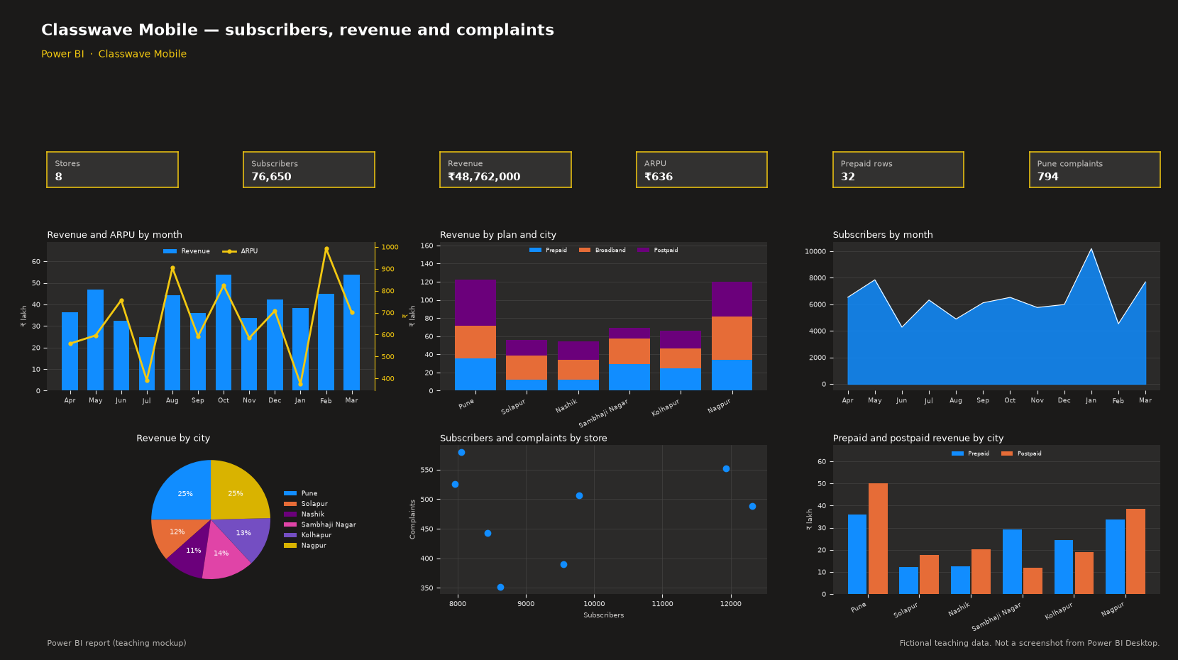
This page is a classroom practice for Classwave Mobile. You download an Excel file, load it in Power BI, and build the same cards and charts as the Excel dashboard. All numbers in this workbook are fictional teaching data, not real company figures.
Download Telecom_PowerBI_Data.xlsx. Your browser will download this Excel file. It does not open as a web page. There is no PBIX file to download. You build the report in Power BI Desktop.
Build the report
- Add a Card for Subscribers. Card. Drag Subscribers. Summary: Sum. The teaching data shows 76,650.
- Add a Card for Revenue. Card. Drag Revenue. Summary: Sum. The teaching data shows ₹48,762,000.
- Add a Card for ARPU. Card. New measure: DIVIDE(SUM(Revenue), SUM(Subscribers)). The teaching data shows ₹636.
- Add a Card for Prepaid rows. Card. Drag Plan. Summary: Count. Filter Plan is Prepaid. The teaching data shows 32.
- Add a Card for Pune complaints. Card. Drag Complaints. Summary: Sum. Filter City is Pune. The teaching data shows 794.
- Add a Line and clustered column chart named Revenue and ARPU by month. X-axis: Month. Column Y-axis: Sum of Revenue. Line Y-axis on the secondary axis: ARPU, which is Sum of Revenue divided by Sum of Subscribers.
- Add a Stacked column chart named Revenue by plan and city. X-axis: City. Legend: Plan. Y-axis: Sum of Revenue.
- Add an Area chart named Subscribers by month. X-axis: Month. Y-axis: Sum of Subscribers.
- Add a Scatter chart named Subscribers and complaints by store. Details: Store. X Axis: Sum of Subscribers. Y Axis: Sum of Complaints.
- Add a Clustered column chart named Prepaid and postpaid revenue by city. X-axis: City. Legend: Plan. Y-axis: Sum of Revenue. Filter Plan to Prepaid and Postpaid.
What you will see
The cards read the same fictional rows as the Excel dashboard: Stores 8, Subscribers 76,650, Revenue ₹48,762,000, ARPU ₹636, Prepaid rows 32, Pune complaints 794.
The dashboard has six charts: a combo of revenue and ARPU by month, a stacked column of revenue by plan and city, an area chart of monthly subscribers, a pie of revenue by city, a scatter of subscribers against complaints, and a clustered column of prepaid and postpaid revenue.
Frequently asked questions
What is this file?
A practice Excel file for a banking Power BI report about Ruhi Nagari Bank. All numbers in this workbook are fictional teaching data, not real company figures.
Where do I load it?
In Power BI Desktop, use Home, Get data, Excel workbook, and load the named table on the Data sheet.
What do the KPI cards show?
Branches 8, Deposits ₹324,480,000, Loans ₹212,040,000, NPA ratio 4.5%, Home loan rows 24, Pune deposits ₹94,540,000.
Is the picture from Power BI Desktop?
No. The picture is a teaching mockup. You build the real report on your computer.