Labs · Power BI
Lab: Build a One-Page Sales Report with KPIs, a Trend and a Breakdown
Course: Power BI · Chapter 24: Reports and Dashboards
Chapter 24 covers reports and dashboards; this lab delivers a complete one-page report from a written brief.
Download pbi_sales.csv (24 orders) Download pbi_cities.csv Download pbi_products.csv
Chala mitrano! Till now we practised one skill per lab. Today we act like a real analyst with a real brief: five questions from the director, one page, finished and polished, even on a phone. This is the page you will show in your portfolio and in interviews. Aaj poorna report, portfolio sathi!
चला मित्रांनो! आत्तापर्यंत आपण प्रत्येक lab मध्ये एक skill शिकलो. आज खऱ्या brief सोबत खऱ्या analyst सारखं काम करू: director चे पाच प्रश्न, एक page, पूर्ण आणि polished, अगदी phone वर सुद्धा. हेच page तुम्ही portfolio मध्ये आणि interviews मध्ये दाखवाल. आज पूर्ण report, portfolio साठी!
चलो दोस्तों! अब तक हमने हर lab में एक skill सीखी। आज असली brief के साथ असली analyst की तरह काम करेंगे: director के पाँच सवाल, एक page, पूरा और polished, phone पर भी। यही page आप portfolio में और interviews में दिखाओगे। आज पूरा report, portfolio के लिए!
Suppose we are…
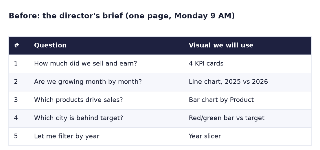
Suppose the Croma Maharashtra director sends us a brief on Friday: "By Monday 9 AM I want one page I can open on my laptop or phone that answers my five questions." The brief is in the Before image. We have every skill from Labs 11 to 23; now we put them together. The numbers are sample data made up for practice.
Goal of this lab
By the end you will have one page called Sales Summary with:
- 4 KPI cards: Total Sales, Total Profit, Margin %, Orders.
- A line chart: Sales by month, 2025 vs 2026.
- A bar chart: Sales by product.
- The red/green city chart vs target with its dynamic title.
- A Year slicer, and a phone layout of the same page.
What you need (all free)
- Power BI Desktop and your Lab 20 or Lab 23 file (measures: Total Sales, Target Amount, Bar Colour, Chart Title).
- Sample data if you need to rebuild: Download pbi_sales.csv (24 orders) Download pbi_cities.csv Download pbi_products.csv
- 50 minutes.
The data: before and after
Before. The brief: five questions and the visual that answers each.
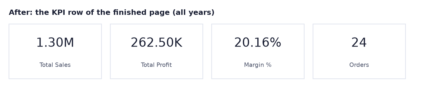
After. The KPI row of the finished page (all years selected).
The formula
The four KPI measures (create any that are missing):
Total Sales  = SUM ( pbi_sales[Sales] )
Total Profit = SUM ( pbi_sales[Sales] ) - SUM ( pbi_sales[Cost] )
Margin %     = DIVIDE ( [Total Profit], [Total Sales] )
Orders       = COUNTROWS ( pbi_sales )
Because they are measures, the whole page reacts to the Year slicer. With 2026 selected: Total Sales 484,000, Total Profit 94,000, Margin % = 94,000 ÷ 484,000 = 19.42%, Orders 8.
Steps
- Open your Lab 20 (or 23) file, Save as
Lab-24-sales-summaryand add a new page named Sales Summary. - Create any missing measures from the formula box. Select Margin % and click % on the Measure tools ribbon.
-
Top row. Add 4 Cards: Total Sales, Total Profit, Margin %, Orders. Same size, aligned with Format → Align → Align top and Distribute horizontally.
What you should see: 1.30M, 262.50K, 20.16%, 24.
-
Trend. Below the cards on the left, add a Line chart: X-axis DateTable[Month], Y-axis Total Sales, Legend DateTable[Year]. Title:
Sales by month, 2025 vs 2026. -
Breakdown. On the right, add a Clustered bar chart: Y-axis pbi_products[Product], X-axis Total Sales, sorted descending, data labels on. Title:
Sales by product.What you should see: Laptop 750K, Mobile 390K, Smartwatch 90K, Headphones 72K.
-
Target. Copy the red/green city chart from your Lab 20 page and paste it below (choose Keep if asked about syncing). Its title should read "2 of 4 cities below target".
- Slicer. Add a Slicer with DateTable[Year], style Tile, in the top-right corner.
-
Click 2026 in the slicer.
What you should see: cards 484K, 94K, 19.42%, 8. Product bars: Laptop 300K, Mobile 135K, Smartwatch 25K, Headphones 24K. Clear the slicer afterwards.
-
Add a text box at the top:
Sales summary – Maharashtra stores (sample data). Pick one theme in View → Themes and remove borders and shadows. -
Phone layout. Click View → Mobile layout. Drag from the right panel onto the phone canvas: first the 4 cards (two rows of two), then the slicer, then the target chart, then the line chart. Leave the product chart out to keep it short.
What you should see: a tall phone-shaped canvas with cards at the top. Click View → Mobile layout again to return.
-
Check the page against the brief: each of the 5 questions has a visual. Save.
Ravindra Bagale's Tip
Before you say "done", read your page as the director would, question by question from her brief, and point at the visual that answers each one. If you cannot point within a second, move or rename that visual. And write "sample data" in the title of any portfolio report, always. Brief vachaa, mag sabmit kara!
Ravindra Bagale's Tip – मराठी
"झालं" म्हणण्याआधी director सारखं page वाचा, तिच्या brief मधला प्रत्येक प्रश्न घेऊन, आणि उत्तर देणाऱ्या visual कडे बोट दाखवा. एका सेकंदात बोट दाखवता आलं नाही, तर तो visual हलवा किंवा rename करा. आणि portfolio report च्या title मध्ये नेहमी "sample data" लिहा. Brief वाचा, मग submit करा!
Ravindra Bagale's Tip – हिंदी
"हो गया" कहने से पहले page को director की तरह पढ़ो, उसके brief का हर सवाल लेकर, और जवाब देने वाले visual की तरफ इशारा करो। एक सेकंड में इशारा न कर पाओ, तो वह visual हिलाओ या rename करो। और portfolio report के title में हमेशा "sample data" लिखो। Brief पढ़ो, फिर submit करो!
Common mistakes
| Mistake | What happens | Fix |
|---|---|---|
| Margin % shown as 0.20 | Looks like a tiny number | Measure tools → % format |
| Cards in different sizes and heights | The page looks unfinished | Same size; Align top and Distribute horizontally |
| Line chart without Year in Legend | One long line mixing 2025 and 2026 months | Put DateTable[Year] in Legend |
| Phone layout not made | On a phone, the page appears tiny and unreadable | View → Mobile layout and place the key visuals |
| Slicer left on 2026 when saving | The director opens it and sees only half the data | Clear slicers before saving |
| No "sample data" note | Someone mistakes it for real company numbers | Say "sample data" in the title |
Self-check checklist
0 of 5 done
Try-at-home challenge
The director adds a sixth question: "How does 2026 compare with the same months of 2025?" (2026 data only covers January to June.) Add one card that answers it. Hint: compare the same six months, not the full year.
Check your answer
Sales H1 2025 = CALCULATE ( [Total Sales], DATESBETWEEN ( DateTable[Date], DATE ( 2025, 1, 1 ), DATE ( 2025, 6, 30 ) ) )
Sales H1 2026 = CALCULATE ( [Total Sales], DATESBETWEEN ( DateTable[Date], DATE ( 2026, 1, 1 ), DATE ( 2026, 6, 30 ) ) )
H1 Growth % = DIVIDE ( [Sales H1 2026] - [Sales H1 2025], [Sales H1 2025] )
H1 2025 = 475,000, H1 2026 = 484,000, growth = +1.9%. Comparing 484,000 with the full 2025 (818,000) would wrongly suggest a 41% fall. In Lab 31 you will do the same with SAMEPERIODLASTYEAR.
Samjla ka? Brief → measures → KPI row → trend → breakdown → slicer → phone layout. Aata pudhe jaauya: publish it to the Power BI Service, pin a dashboard and schedule a refresh.