Labs · Power BI
Lab: Install Power BI Desktop and Find the Report, Table and Model Views, the Data Pane and the Visualizations Pane
Course: Power BI · Chapter 2: Installation and Interface Tour
Chapter 2 shows the interface; this lab makes you click every part of it once.
Chala mitrano! The first time you open Power BI, the screen looks like an aeroplane cockpit. Don't worry. There are only 4 views on the left and 3 panes on the right that you use every day. Today we install it and touch each one once, with real data, so tomorrow nothing is a stranger.
चला मित्रांनो! पहिल्यांदा Power BI उघडलं की screen विमानाच्या cockpit सारखी दिसते. काळजी करू नका. डावीकडे फक्त 4 views आणि उजवीकडे 3 panes आहेत जे रोज लागतात. आज install करू आणि प्रत्येकाला real data सोबत एकदा हात लावू, म्हणजे उद्या कोणीच अनोळखी नसेल.
चलो दोस्तों! पहली बार Power BI खोलो तो screen हवाई जहाज़ के cockpit जैसी लगती है। चिंता मत करो। बाईं तरफ सिर्फ 4 views और दाईं तरफ 3 panes हैं जो रोज़ काम आते हैं। आज install करेंगे और हर एक को real data के साथ एक बार छूएंगे, ताकि कल कोई अजनबी न लगे।
Suppose we are…
Suppose we have just joined the analytics team of Croma (the electronics retail chain) in Maharashtra. On day one, our team lead gives us a small file of 24 orders from four stores (Mumbai, Pune, Nagpur and Nashik) and says: "Install Power BI Desktop, load this file, and tell me how much each city sold. Then show me only Laptop sales."
The file is sample data made up for practice, not real Croma figures. We will use the same file in many later labs, so keep it safe.
Goal of this lab
By the end you will have:
- Installed Power BI Desktop for free.
- Loaded
pbi_sales.csvand seen its 24 rows. - Used all four views (Report, Table, Model, DAX query) and the three panes (Data, Visualizations, Filters) once.
- Saved your first file,
Lab-02-tour.pbix.
What you need (all free)
- A Windows 10 or Windows 11 (64-bit) laptop. Power BI Desktop does not run on a Mac; Mac users need a Windows PC, a Windows virtual machine or a college lab PC.
- About 1 GB of free disk space and an internet connection for the install.
- The sample file: Download pbi_sales.csv (24 orders)
- 30 minutes.
The data: before and after
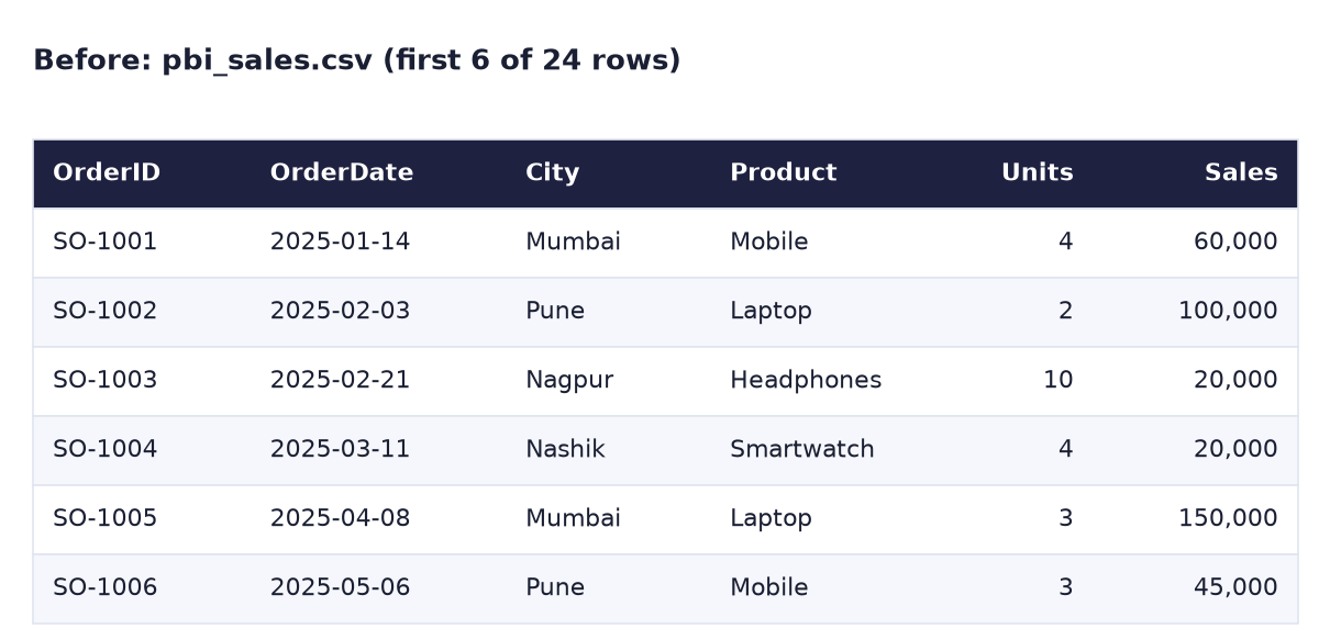
Before. The first 6 of 24 orders, as they arrive in the CSV file.
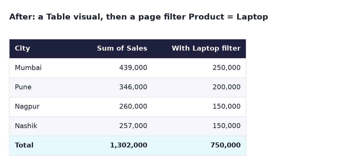
After. A Table visual of sales by city (total 1,302,000), and the same table after a page filter Product = Laptop (total 750,000).
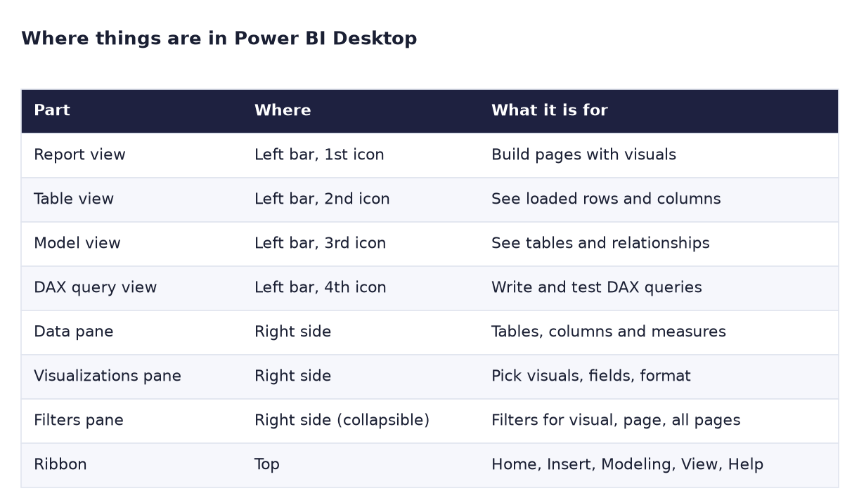
And this is your map of the screen. Keep it open while you do the steps:
The formula
No formula to type today. But one is hiding: when you tick a number column such as Sales, Power BI adds it up for you. In the Data pane, Sales gets a Σ (sigma) sign, which means "this column will be summed by default". The table visual calls it Sum of Sales. For Mumbai, Power BI quietly does 60,000 + 150,000 + 30,000 + 75,000 + 100,000 + 24,000 = 439,000. In the DAX lab you will write this yourself as SUM ( pbi_sales[Sales] ).
Steps
-
Check your Windows version: Settings → System → About.
What you should see: "System type: 64-bit operating system" and Windows 10 or 11.
-
Open the Microsoft Store app, search for Power BI Desktop and click Get (or Install). The publisher must be Microsoft Corporation.
What you should see: the button changes to Open after a few minutes. The Store version updates itself every month.
-
Click Open. If a sign-in box appears, close it with the X: Power BI Desktop works without an account.
What you should see: a start screen with Blank report and recent files.
-
Click Blank report. Then, on the Home ribbon, click Get data → Text/CSV, pick
pbi_sales.csvfrom your Downloads folder and click Load.What you should see: in the Data pane on the right, a table called pbi_sales with 7 fields. Units, Sales and Cost have a Σ sign.
-
On the thin bar on the far left, click the second icon, Table view.
What you should see: all the rows in a grid, and at the bottom left: Table: pbi_sales (24 rows).
-
Click the third icon, Model view.
What you should see: one box called pbi_sales listing its columns. Later, with more tables, the relationship lines appear here.
-
Click the fourth icon, DAX query view. Type
EVALUATE pbi_salesin the editor and click Run.What you should see: the same 24 rows in a result grid below the editor. EVALUATE simply means "show me this table".
-
Click the first icon, Report view, to go back to the blank page (the canvas).
-
In the Data pane, tick City first, then tick Sales.
What you should see: a Table visual with Mumbai 439,000, Pune 346,000, Nagpur 260,000, Nashik 257,000 and a Total of 1,302,000. If you ticked Sales first, you get a column chart instead: no problem, click the Table icon in Visualizations to switch it.
-
Find the Visualizations pane. With the table selected, click the Clustered bar chart icon, look at the chart, then click the Table icon again to switch back.
-
Find the Filters pane (it may be folded: click the small Filters tab to open it). Drag Product from the Data pane into the box Filters on this page and tick Laptop.
What you should see: Mumbai 250,000, Pune 200,000, Nagpur 150,000, Nashik 150,000 and a Total of 750,000.
-
Click File → Save as, choose a folder such as
Documents\PowerBI-Labsand save asLab-02-tour.What you should see: the title bar now shows Lab-02-tour. The file on disk ends in .pbix.
Ravindra Bagale's Tip
Panes disappeared? It happens to everyone. Go to the View ribbon and switch on Data, Visualizations or Filters again. And remember: the page filter stays on until you remove it. If your numbers look too small tomorrow, look at the Filters pane first. Pehle filter bagha!
Ravindra Bagale's Tip – मराठी
Panes गायब झाले? सगळ्यांच्या बाबतीत होतं. View ribbon वर जा आणि Data, Visualizations किंवा Filters परत चालू करा. आणि लक्षात ठेवा: page filter काढेपर्यंत चालूच राहतो. उद्या numbers खूप छोटे दिसले, तर आधी Filters pane बघा. पहिले filter बघा!
Ravindra Bagale's Tip – हिंदी
Panes गायब हो गए? सबके साथ होता है। View ribbon पर जाओ और Data, Visualizations या Filters फिर से चालू करो। और याद रखो: page filter हटाने तक लगा रहता है। कल numbers बहुत छोटे दिखें, तो पहले Filters pane देखो। पहले filter देखो!
Common mistakes
| Mistake | What happens | Fix |
|---|---|---|
| Downloading from a random website | Old version or unwanted software | Use the Microsoft Store (publisher Microsoft Corporation) |
| Trying to install on a Mac | There is no Mac version of Power BI Desktop | Use a Windows PC or a Windows virtual machine |
| Clicking Transform data instead of Load | The Power Query window opens | Fine too: click Close & Apply at top left |
| Ticking Sales before City | You get a column chart, not a table | Click the Table icon in Visualizations |
| Forgetting the Laptop filter is on | Every visual on the page shows only Laptop | Clear it with the eraser icon on the filter card |
| Closing without saving | All work is lost | File → Save as before you close |
Self-check checklist
0 of 6 done
Try-at-home challenge
Without using the Filters pane, find out how many units of Mobile were sold in Pune. Hint: put City and Units in a table and use a Slicer visual (from the Visualizations pane) on Product.
Check your answer
Add a Slicer, drag Product into it and click Mobile. In the City/Units table, Pune shows 7 units (3 in May 2025 + 4 in February 2026). The total for Mobile across all four cities is 26 units (390,000 ÷ 15,000). A slicer is a filter that sits on the page where the user can click it; the Filters pane is for the report builder.
Samjla ka? Four views on the left, three panes on the right, and Σ means "add it up". Aata pudhe jaauya: connect Power BI to a real database and compare Import with DirectQuery.