Labs · Power BI
Lab: Switch the Chart's Measure with a Field Parameter and Add a Top N Selector
Course: Power BI · Chapter 21: Dynamic Charts: Field Parameters, What-if and Dynamic Top N
Chapter 21 covers field parameters, what-if and dynamic Top N; this lab builds the two that users ask for most.
Download pbi_sales.csv (24 orders) Download pbi_cities.csv Download pbi_products.csv
Chala mitrano! Without dynamic charts, every new question means a new chart: one for sales, one for profit, one for units, then top 2, top 3… The page explodes. Today one chart answers all of them. The user picks the measure and slides the number, and the chart follows. Ek chart, anek prashna!
चला मित्रांनो! Dynamic charts शिवाय प्रत्येक नवीन प्रश्न म्हणजे नवीन chart: एक sales साठी, एक profit साठी, एक units साठी, मग top 2, top 3… Page फुटून जातं. आज एकच chart सगळ्यांची उत्तरं देईल. User measure निवडतो आणि number slide करतो, आणि chart मागे येतो. एक chart, अनेक प्रश्न!
चलो दोस्तों! Dynamic charts के बिना हर नया सवाल मतलब नया chart: एक sales के लिए, एक profit के लिए, एक units के लिए, फिर top 2, top 3… Page फट जाता है। आज एक ही chart सबका जवाब देगा। User measure चुनता है और number slide करता है, और chart साथ चलता है। एक chart, अनेक सवाल!
Suppose we are…
Suppose the Croma sales director, the finance head and the logistics head all use the same page. The director asks for Sales by city, finance for Profit, logistics for Units. And all three say "show me only the top 2" one day and "top 3" the next. Instead of six charts, we build one chart with a Metric slicer and one chart with a Top N slider. The numbers are sample data made up for practice.
Goal of this lab
By the end you will have:
- A field parameter called Metric with Total Sales, Total Profit and Units, and a slicer to choose one.
- A numeric range parameter called Top N (1 to 4) with a slider.
- A chart that shows only the top N cities by sales, using RANKX.
What you need (all free)
- Power BI Desktop and a star-schema file from Lab 11 or later.
- Sample data if you need to rebuild: Download pbi_sales.csv (24 orders) Download pbi_cities.csv Download pbi_products.csv
- 40 minutes.
The data: before and after
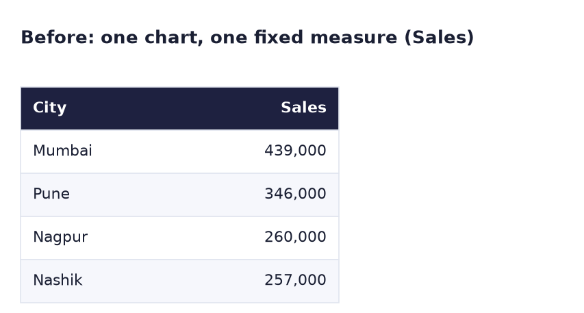
Before. One chart, one fixed measure.
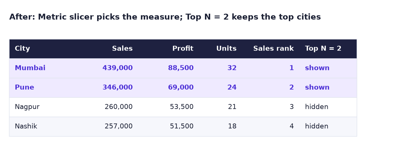
After. The Metric slicer chooses which column the chart shows; Top N = 2 keeps only the two best cities by sales.
The formula
Two base measures (skip any you already have):
Total Profit = SUM ( pbi_sales[Sales] ) - SUM ( pbi_sales[Cost] )
Units = SUM ( pbi_sales[Units] )
When you create the field parameter, Power BI writes this table for you:
Metric = {
    ( "Total Sales", NAMEOF ( 'pbi_sales'[Total Sales] ), 0 ),
    ( "Total Profit", NAMEOF ( 'pbi_sales'[Total Profit] ), 1 ),
    ( "Units", NAMEOF ( 'pbi_sales'[Units] ), 2 )
}
Each row is (label, which measure, order). Selecting a label in the slicer tells the chart which measure to use. (Your table name may differ if your measures live in another table.)
For Top N, the numeric range parameter creates a table 'Top N' and a measure [Top N Value]. We add:
Sales Rank = RANKX ( ALL ( pbi_cities[City] ), [Total Sales] )

Top N Sales = IF ( [Sales Rank] <= [Top N Value], [Total Sales] )
ALL ( pbi_cities[City] )ranks each city against all cities, not just itself. Mumbai = 1, Pune = 2, Nagpur = 3, Nashik = 4.- If the rank is within N, return the sales; otherwise return nothing (blank). Visuals hide rows where the measure is blank, so only N bars remain.
Steps
Part A: field parameter
- Open your file, Save as
Lab-21-dynamic, add the Total Profit and Units measures if missing. - Click Modeling → New parameter → Fields. (Missing? Turn it on in File → Options and settings → Options → Preview features → Field parameters, then restart.)
-
Name it
Metric. From the field list, add Total Sales, Total Profit and Units in that order. Keep Add slicer to this page ticked. Click Create.What you should see: a new table Metric in the Data pane and a slicer with three choices on the page.
-
Make a Clustered bar chart: Y-axis pbi_cities[City], X-axis Metric (the field from the Metric table). Turn on data labels.
-
In the Metric slicer, click Total Profit.
What you should see: Mumbai 88.5K, Pune 69K, Nagpur 53.5K, Nashik 51.5K.
-
Click Units.
What you should see: Mumbai 32, Pune 24, Nagpur 21, Nashik 18. The axis title changes to Units by itself.
-
In the slicer's Format → Slicer settings → Options, set Style to Tile (or Vertical list) and switch on Single select.
Part B: Top N slider
-
Click Modeling → New parameter → Numeric range. Name
Top N, Data type Whole number, Minimum1, Maximum4, Increment1, Default2. Keep Add slicer to this page ticked. Click Create.What you should see: a slider slicer and a table Top N with a measure Top N Value.
-
Add the measures Sales Rank and Top N Sales from the formula box (right-click pbi_sales → New measure).
-
Make a second Clustered bar chart: Y-axis pbi_cities[City], X-axis Top N Sales. Title:
Top cities by sales.What you should see: with the slider on 2, only Mumbai (439K) and Pune (346K).
-
Move the slider to 3.
What you should see: Nagpur (260K) appears. At 1, only Mumbai. At 4, all four.
-
Save.
Ravindra Bagale's Tip
RANKX needs ALL. Without ALL ( pbi_cities[City] ), each city is ranked only against itself, so every city is number 1 and the Top N chart shows everything. If your Top N "does not work", check ALL first. Ranking mhanje sarvanshi tulana!
Ravindra Bagale's Tip – मराठी
RANKX ला ALL लागतो. ALL ( pbi_cities[City] ) नसेल तर प्रत्येक city फक्त स्वतःशी rank होते, म्हणजे प्रत्येक city नंबर 1 आणि Top N chart सगळं दाखवतो. Top N "चालत नसेल" तर आधी ALL check करा. Ranking म्हणजे सगळ्यांशी तुलना!
Ravindra Bagale's Tip – हिंदी
RANKX को ALL चाहिए। ALL ( pbi_cities[City] ) के बिना हर city सिर्फ खुद से rank होती है, यानी हर city नंबर 1 और Top N chart सब कुछ दिखाता है। Top N "काम नहीं कर रहा" तो पहले ALL check करो। Ranking मतलब सबसे तुलना!
Common mistakes
| Mistake | What happens | Fix |
|---|---|---|
RANKX ( pbi_cities, … ) without ALL |
Every city has rank 1; all bars show | RANKX ( ALL ( pbi_cities[City] ), [Total Sales] ) |
| Putting a measure in the field parameter that does not exist yet | It is not in the list | Create the measure first, then the parameter |
| Metric slicer allows multi-select | The chart shows two measures side by side | Slicer settings → Single select |
| Top N slider range 1–100 for 4 cities | Values above 4 change nothing | Set Maximum to the number of items |
| Ranking on pbi_sales[City] (hidden fact column) | Wrong or repeated ranks | Rank the dimension column pbi_cities[City] |
| Expecting Top N to follow the Metric slicer | Top N here ranks by sales only | See the challenge for a version that ranks by the chosen metric |
Self-check checklist
0 of 4 done
Try-at-home challenge
Make the Top N chart rank by whatever metric is selected in the Metric slicer. Hint: read the selected order number from the Metric table with SELECTEDVALUE and use SWITCH to pick the measure.
Check your answer
Selected Metric Value =
SWITCH ( SELECTEDVALUE ( Metric[Metric Order], 0 ),
    0, [Total Sales], 1, [Total Profit], 2, [Units] )

Metric Rank = RANKX ( ALL ( pbi_cities[City] ), [Selected Metric Value] )

Top N Metric = IF ( [Metric Rank] <= [Top N Value], [Selected Metric Value] )
Use Top N Metric on the X-axis. The order column is called Metric Order by default (check the Metric table in Table view). With Units and Top N = 3: Mumbai 32, Pune 24, Nagpur 21. In this sample the order is the same for all three metrics; change a number in the CSV (for example give Nashik 20 more Headphones units) and refresh to see the ranking change for Units only.
Samjla ka? A field parameter picks the measure, a numeric range parameter gives N, RANKX with ALL does the ranking. Aata pudhe jaauya: add slicers and sync them across two pages.