Labs · Power BI
Lab: Colour Bars Red or Green with a DAX Measure and Write a Dynamic Title
Course: Power BI · Chapter 20: Dynamic Text and Dynamic Colour (Conditional Formatting)
Chapter 20 covers dynamic text and dynamic colour; this lab does both on one chart.
Download pbi_sales.csv (24 orders) Download pbi_cities.csv (with Target) Download pbi_products.csv
Chala mitrano! A chart where every bar is blue makes the manager do the work: "Is 346K good or bad?" A chart where Pune is red answers that before she asks. And a title that says "2 of 4 cities below target" tells the story in one line. Today we make the chart talk. Rang bolto, title sangto!
चला मित्रांनो! प्रत्येक bar निळा असलेला chart manager ला काम करायला लावतो: "346K चांगलं की वाईट?" Pune लाल असलेला chart ती विचारण्याआधीच उत्तर देतो. आणि "2 of 4 cities below target" म्हणणारा title एका ओळीत गोष्ट सांगतो. आज आपण chart ला बोलायला लावू. रंग बोलतो, title सांगतो!
चलो दोस्तों! हर bar नीला हो तो chart manager से काम करवाता है: "346K अच्छा है या बुरा?" Pune लाल हो तो chart उसके पूछने से पहले जवाब दे देता है। और "2 of 4 cities below target" कहने वाला title एक line में कहानी बता देता है। आज हम chart को बोलना सिखाएंगे। रंग बोलता है, title बताता है!
Suppose we are…
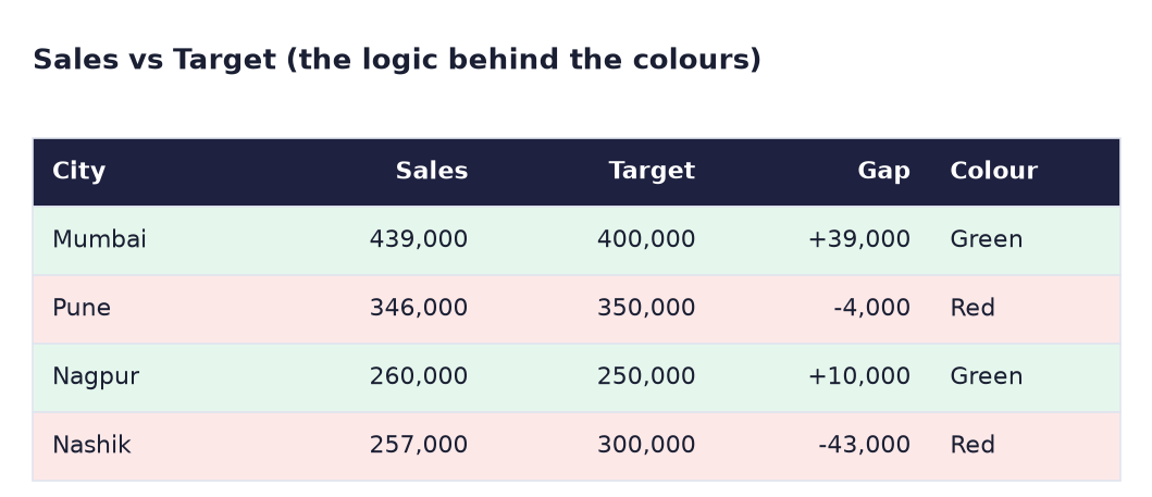
Suppose we are preparing the Croma monthly review. Each city has a sales target in pbi_cities.csv: Mumbai 400,000, Pune 350,000, Nagpur 250,000, Nashik 300,000. The director wants the city chart to show at a glance who met the target, and a title that updates itself when the data changes. The numbers are sample data made up for practice.
Goal of this lab
By the end you will have:
- Measures for Target, a bar colour and the number of cities below target.
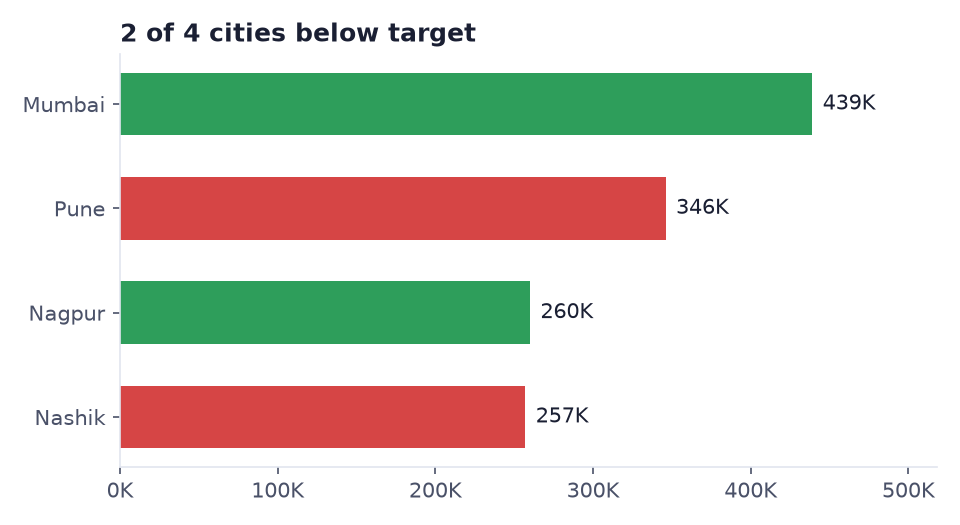
- A bar chart with green bars for Mumbai and Nagpur and red bars for Pune and Nashik.
- A title that reads "2 of 4 cities below target", written by DAX.
What you need (all free)
- Power BI Desktop and a file with the star schema from Lab 11 (pbi_sales, pbi_cities with Target, Total Sales).
- Sample data if you need to rebuild: Download pbi_sales.csv (24 orders) Download pbi_cities.csv (with Target) Download pbi_products.csv
- 30 minutes.
The data: before and after
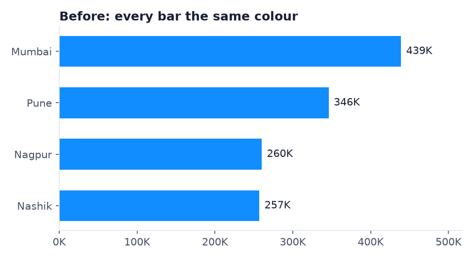
Before. Every bar is the same colour. Good or bad? You cannot tell.
After. Green = target met, red = below target, and the title counts the red ones.
The logic behind the colours:
The formula
Four short measures:
Target Amount = SUM ( pbi_cities[Target] )

Bar Colour = IF ( [Total Sales] >= [Target Amount], "#2E9E5B", "#D64545" )

Cities Below Target =
COUNTROWS ( FILTER ( VALUES ( pbi_cities[City] ), [Total Sales] < [Target Amount] ) )

Chart Title =
[Cities Below Target] & " of " & COUNTROWS ( VALUES ( pbi_cities[City] ) ) & " cities below target"
- Bar Colour returns a text colour code. For Pune: 346,000 ≥ 350,000? No, so it returns red
#D64545. - Cities Below Target:
VALUESgives the list of cities in the current filter,FILTERkeeps those below target (Pune, Nashik), andCOUNTROWScounts them: 2. - Chart Title joins numbers and text with
&: "2" & " of " & "4" & " cities below target".
Steps
- Open your star-schema file and Save as
Lab-20-dynamic-colour. - Right-click pbi_cities → New measure and create Target Amount, then Bar Colour, Cities Below Target and Chart Title from the formula box (one measure at a time).
-
Make a Clustered bar chart: Y-axis pbi_cities[City], X-axis Total Sales. Turn on data labels.
What you should see: all bars in one colour, like the Before image.
-
Select the chart → Format visual → Visual → Bars → Colors. Click the fx button next to the colour.
-
In the window, set Format style to Field value, and What field should we base this on? to Bar Colour. Click OK.
What you should see: Mumbai and Nagpur green, Pune and Nashik red.
-
Go to Format visual → General → Title, click the fx next to Text, choose Field value and Chart Title. Click OK.
What you should see: the title reads 2 of 4 cities below target.
-
Add a Table with City, Total Sales, Target Amount and a gap measure
Gap = [Total Sales] - [Target Amount].What you should see: Gap: Mumbai 39,000, Pune -4,000, Nagpur 10,000, Nashik -43,000.
-
Test the dynamic part. Add a Slicer with pbi_cities[Region] and click Konkan.
What you should see: one green bar (Mumbai) and the title 0 of 1 cities below target. Clear the slicer.
-
Save.
Ravindra Bagale's Tip
Do not use only red and green: about 1 in 12 men has red-green colour blindness. Add a second signal: data labels with the gap, or a small ▲ ▼ in a table. And keep colour for meaning only. If every bar has a different colour, red means nothing. Rang kami, artha jaast!
Ravindra Bagale's Tip – मराठी
फक्त लाल आणि हिरवा वापरू नका: साधारण 12 पैकी 1 पुरुषाला red-green colour blindness असतो. दुसरी खूण द्या: gap असलेले data labels, किंवा table मध्ये छोटे ▲ ▼. आणि रंग फक्त अर्थासाठी वापरा. प्रत्येक bar वेगळ्या रंगाचा असेल तर लाल रंगाला काही अर्थ उरत नाही. रंग कमी, अर्थ जास्त!
Ravindra Bagale's Tip – हिंदी
सिर्फ लाल और हरा इस्तेमाल मत करो: लगभग 12 में से 1 आदमी को red-green colour blindness होती है। दूसरा संकेत दो: gap वाले data labels, या table में छोटे ▲ ▼। और रंग सिर्फ मतलब के लिए रखो। हर bar अलग रंग का हो तो लाल का कोई मतलब नहीं बचता। रंग कम, मतलब ज़्यादा!
Common mistakes
| Mistake | What happens | Fix |
|---|---|---|
Colour measure returns Red/Green with a typo, e.g. "Gren" |
The bar turns black or default | Use hex codes like "#2E9E5B" |
| Choosing Gradient or Rules instead of Field value | The colour measure is ignored | Format style → Field value |
| Target taken from pbi_sales (no Target column there) | Error or blank | Target is in pbi_cities |
Title measure without VALUES |
Always shows the total count, even with a slicer | Count VALUES ( pbi_cities[City] ) so it follows filters |
| Using a calculated column for the colour | Colour does not change with slicers | Use a measure |
| Bars coloured by Legend instead of fx | Every city gets its own random colour | Remove Legend; use fx → Field value |
Self-check checklist
0 of 4 done
Try-at-home challenge
Add a Product slicer and make a second title that says which product is selected: "Sales for Laptop" when one product is selected, and "Sales for all products" when none or several are selected. Hint: SELECTEDVALUE.
Check your answer
Product Title = "Sales for " & SELECTEDVALUE ( pbi_products[Product], "all products" )SELECTEDVALUE returns the product when exactly one is selected, otherwise the second argument. Click Laptop: "Sales for Laptop". Clear it: "Sales for all products". Note: with Laptop selected, the red/green colours compare Laptop sales with the whole city target, so every bar turns red. That is a good discussion point: a target must match the level of the data.
Samjla ka? A colour measure returns a hex code; fx → Field value applies it; a text measure writes the title. Aata pudhe jaauya: switch the chart's measure with a field parameter and add a Top N selector.