Labs · Power BI
Lab: Plan a One-Page KPI Report for a Food-Delivery Business on Paper Before Opening Power BI
Course: Power BI · Chapter 1: Introduction to Business Intelligence and Power BI
Chapter 1 explains what BI is; this lab plans a real report before any clicking.
Chala mitrano! Most beginners open Power BI first and think later. Professionals do the opposite: they decide the questions and the numbers on paper, and only then build. Today no Power BI at all. Just 12 orders, a pencil and your brain. Ekda plan pakka, mag report sopa!
चला मित्रांनो! बहुतेक beginners आधी Power BI उघडतात आणि नंतर विचार करतात. Professionals उलटं करतात: आधी कागदावर प्रश्न आणि numbers ठरवतात, आणि मगच build करतात. आज Power BI अजिबात नाही. फक्त 12 orders, एक pencil आणि तुमचं डोकं. एकदा plan पक्का, मग report सोपा!
चलो दोस्तों! ज़्यादातर beginners पहले Power BI खोलते हैं और बाद में सोचते हैं। Professionals उल्टा करते हैं: पहले कागज़ पर सवाल और numbers तय करते हैं, फिर build करते हैं। आज Power BI बिल्कुल नहीं। सिर्फ 12 orders, एक pencil और आपका दिमाग। एक बार plan पक्का, फिर report आसान!
Suppose we are…
Suppose we are a new analyst in the Pune city team of Swiggy. The city head wants "one page" every Monday that tells her how food delivery went last week in four areas: Kothrud, Baner, Hadapsar and Viman Nagar. She has no time to read tables. She asks: "How much did we sell, how fast did we deliver, how many orders were cancelled, and are customers happy?"
Before we open any tool, we take a small sample of 12 orders and plan the page. The data is sample data made up for practice, not real Swiggy figures. Restaurant names are used only to make the example feel real.
A KPI (Key Performance Indicator) is one number that shows if the business is doing well, for example "average delivery time".
Goal of this lab
By the end you will have, on one sheet of paper:
- 4 business questions written in plain words.
- 6 KPIs, each with a definition, the value for our 12 orders and the visual you will use.
- A sketch of the one-page report: KPI cards on top, a chart in the middle, a table at the bottom.
What you need (all free)
- Paper and a pencil (or a blank page in any notes app).
- Excel or Google Sheets, only to open the CSV and check your sums.
- The sample file: Download swiggy_orders_sample.csv (12 orders)
- 30 minutes.
The data: before and after
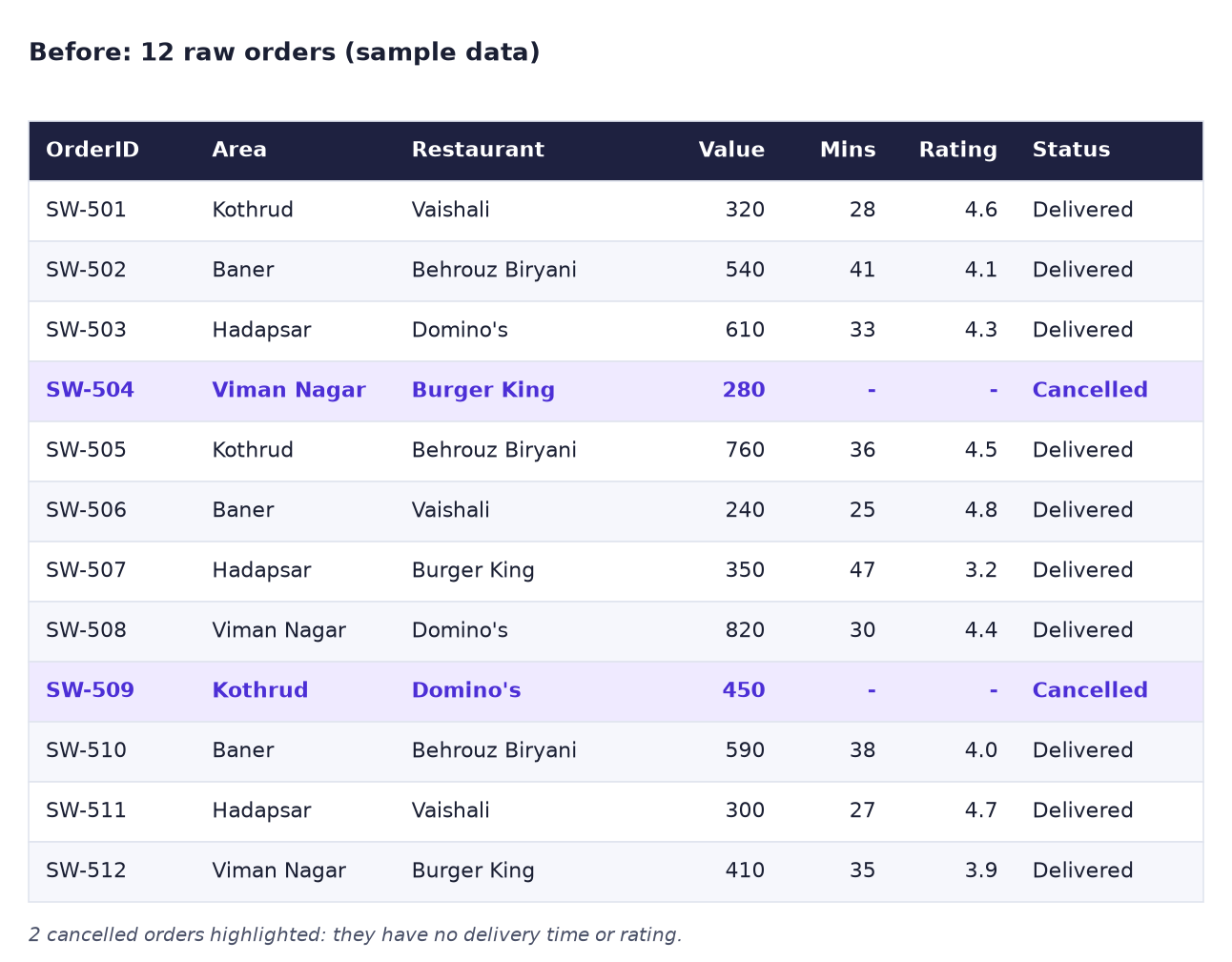
Before. Twelve raw orders. Two of them were cancelled, so they have no delivery time and no rating.
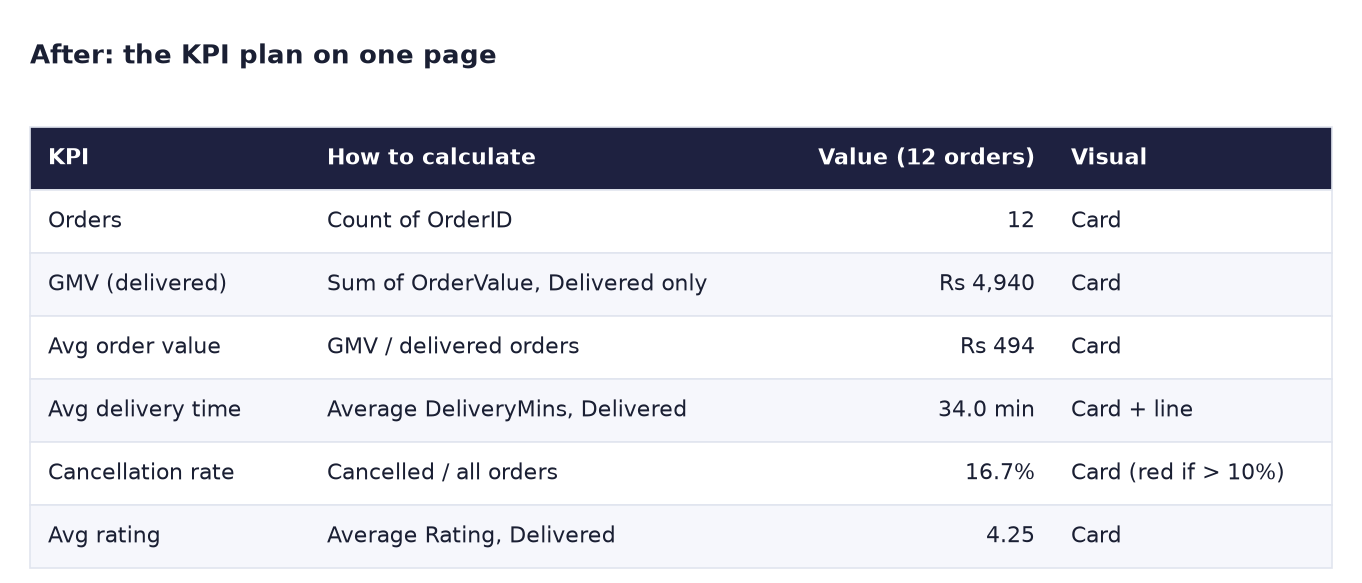
After. The same 12 rows turned into a KPI plan: what each KPI means, its value today and how it will be shown.
The formulas
These are not DAX yet. They are plain rules that you will later turn into Power BI measures:
| KPI | Rule in words | Our 12 orders |
|---|---|---|
| Orders | Count all orders | 12 |
| GMV | Add OrderValue of Delivered orders only | 4,940 |
| Avg order value | GMV ÷ number of delivered orders | 4,940 ÷ 10 = 494 |
| Avg delivery time | Add DeliveryMins of delivered orders ÷ 10 | 340 ÷ 10 = 34.0 min |
| Cancellation rate | Cancelled orders ÷ all orders | 2 ÷ 12 = 16.7% |
| Avg rating | Add Rating of delivered orders ÷ 10 | 42.5 ÷ 10 = 4.25 |
GMV (Gross Merchandise Value) is the total value of orders that were actually delivered. Notice the most important decision in this lab: cancelled orders are left out of GMV, delivery time and rating, but kept in the cancellation rate. If you average the zeros of the cancelled orders, the average delivery time drops to 28.3 minutes and looks better than the truth.
Steps
-
Download
swiggy_orders_sample.csvand open it in Excel (double-click) or in Google Sheets (File → Import → Upload).What you should see: 12 rows, from SW-501 to SW-512, and 9 columns from OrderID to Status.
-
On paper, write the heading "Pune weekly delivery report" and, under it, the city head's 4 questions in your own words:
- How much did we sell?
- How fast did we deliver?
- How many orders did we lose?
- Are customers happy?
-
Next to each question, write the KPI that answers it: GMV and Avg order value for 1, Avg delivery time for 2, Cancellation rate for 3, Avg rating for 4. Add Orders as the sixth KPI because every manager asks "how many".
-
In the sheet, click the Status column header and use Data → Filter (Excel) or Data → Create a filter (Google Sheets). Filter Status to Cancelled.
What you should see: 2 rows: SW-504 (Burger King, Viman Nagar) and SW-509 (Domino's, Kothrud).
-
Now filter Status to Delivered only. Select the OrderValue cells and read the Sum at the bottom right of the window.
What you should see: Sum = 4,940 and Count = 10.
If your sheet shows 5,670, it is also adding the hidden cancelled rows. Type
=SUBTOTAL(9, F2:F13)in an empty cell instead: SUBTOTAL adds only the rows the filter shows. -
Do the same for DeliveryMins and Rating, but read the Average at the bottom right.
What you should see: Average DeliveryMins = 34, Average Rating = 4.25. (With SUBTOTAL, use
=SUBTOTAL(1, G2:G13)and=SUBTOTAL(1, H2:H13): 1 means average.) -
Write each value in your KPI table on paper, exactly like the "After" image. Add a Visual column: a Card for each KPI, and a note "red if above 10%" next to the cancellation rate.
- Now sketch the page. Draw a rectangle (the page). Across the top, draw 6 small boxes (the KPI cards). In the middle, on the left, draw a bar chart titled "GMV by area". On the right, draw a line chart titled "Avg delivery time by day". At the bottom, draw a small table "Lowest-rated restaurants".
-
Fill in the bar chart with real numbers. Filter by Area (Delivered only) and add the OrderValue:
What you should see: Baner 1,370, Hadapsar 1,260, Viman Nagar 1,230, Kothrud 1,080. These four add up to 4,940, the same as the GMV card.
-
Under the sketch, write one line: "Data: one row per order. Filters: Delivered only for GMV, time and rating." Take a photo of your page. You will build this exact report in Power BI in later labs.
Ravindra Bagale's Tip
Always check that the parts add up to the whole: the four area bars must add up to the GMV card. If they do not, a filter is different somewhere. This one habit catches most report bugs before your manager does. Sagla total match hava!
Ravindra Bagale's Tip – मराठी
नेहमी check करा की parts मिळून whole बनतो: चार area bars ची बेरीज GMV card इतकी आली पाहिजे. नाही आली, तर कुठेतरी filter वेगळा आहे. ही एक सवय manager च्या आधी बहुतेक report bugs पकडते. सगळा total match हवा!
Ravindra Bagale's Tip – हिंदी
हमेशा check करो कि parts मिलकर whole बनता है: चारों area bars का जोड़ GMV card जितना होना चाहिए। अगर नहीं है, तो कहीं filter अलग है। यह एक आदत manager से पहले ज़्यादातर report bugs पकड़ लेती है। पूरा total match होना चाहिए!
Common mistakes
| Mistake | What happens | Fix |
|---|---|---|
| Counting cancelled orders in GMV | GMV shows 5,670 instead of 4,940 | GMV = Delivered orders only |
| Averaging the 0 minutes of cancelled orders | Avg delivery time looks like 28.3 min, better than the truth | Average delivered orders only |
| Too many KPIs (10 or more cards) | Nobody reads the page | Keep 4 to 6 KPIs, one per question |
| A KPI with no definition | Two people calculate it two ways | Write the rule in words next to every KPI |
| Chart titles like "Chart 1" | The reader does not know what it answers | Title = the question, e.g. "GMV by area" |
Self-check checklist
0 of 6 done
Try-at-home challenge
The city head adds one more question: "How many deliveries were late?" Swiggy's promise in this example is 40 minutes. Define a KPI called Late delivery %, calculate it for our 12 orders and decide where it goes on your page.
Check your answer
Rule: delivered orders with DeliveryMins above 40 ÷ all delivered orders. Two orders are late: SW-502 (41 min, Baner) and SW-507 (47 min, Hadapsar). Late delivery % = 2 ÷ 10 = 20%. It belongs next to Avg delivery time in the top row, as a card with a red colour rule above 10%. The average (34 min) looks fine, but 1 in 5 customers waited too long: that is why we need both numbers.
Samjla ka? Questions first, KPI rules second, Power BI last. Aata pudhe jaauya: install Power BI Desktop and find every pane you will need for this page.