Labs · Power BI
Lab: Load a Sales CSV into Power BI Desktop and Build Your First Bar Chart
Course: Power BI · Chapter 3: Getting Data
Chapter 3 covers Get data; this lab is your first load-and-chart.
Chala mitrano! Today is your first real Power BI report. We take a small CSV file with 12 sales rows, load it into Power BI Desktop and turn it into a bar chart that answers one question: which city sold the most? Twelve rows only, so you can check every number with your own eyes.
चला मित्रांनो! आज तुमचा पहिला खरा Power BI report. 12 sales rows असलेली एक छोटी CSV file घ्यायची, Power BI Desktop मध्ये load करायची आणि एका प्रश्नाचं उत्तर देणारा bar chart बनवायचा: कोणत्या city ने सगळ्यात जास्त विकलं? फक्त बारा rows आहेत, म्हणून प्रत्येक number तुम्ही स्वतः check करू शकता.
चलो दोस्तों! आज आपका पहला असली Power BI report। 12 sales rows वाली एक छोटी CSV file लेंगे, Power BI Desktop में load करेंगे और एक सवाल का जवाब देने वाला bar chart बनाएंगे: किस city ने सबसे ज़्यादा बेचा? सिर्फ बारह rows हैं, इसलिए हर number आप खुद check कर सकते हो।
Suppose we are…
Suppose we have just joined Flipkart as a junior data analyst. On our first Monday, the regional manager sends a small CSV file (comma-separated values: a plain-text table where commas separate the columns) with two weeks of sales from Mumbai, Pune and Nagpur. Her question is simple: "Which city sold the most, and by how much?" She wants a chart, not a long table.
The numbers in this lab are sample data made up for practice, not real Flipkart figures.
Goal of this lab
By the end you will have:
- Loaded a CSV file into Power BI Desktop with Get data → Text/CSV.
- Checked the loaded rows in Table view.
- Built a clustered bar chart (horizontal bars) of total sales by city, sorted from biggest to smallest, with data labels.
- Saved your first
.pbixfile (the Power BI Desktop report file).
What you need (all free)
- A Windows 10/11 laptop or PC. Power BI Desktop runs only on Windows; on a Mac, use a Windows virtual machine or a college/institute lab PC.
- Power BI Desktop (free) from the Microsoft Store.
- The sample file: Download city_sales.csv (12 rows)
- 30 minutes.
The data: before and after
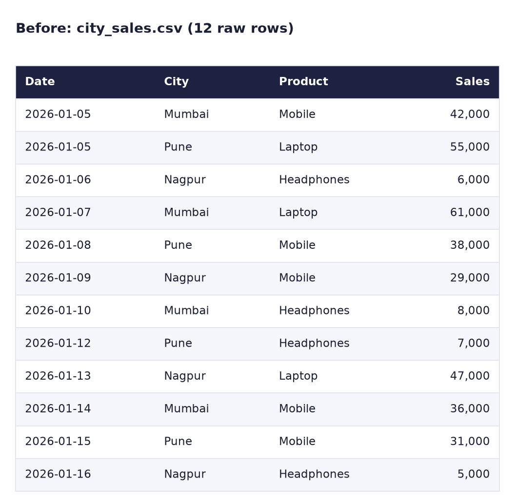
Here is the file exactly as you download it: 12 rows, 4 columns (Date, City, Product, Sales in rupees).
And here is the answer we want Power BI to calculate for us: one row per city, with all its sales added up.
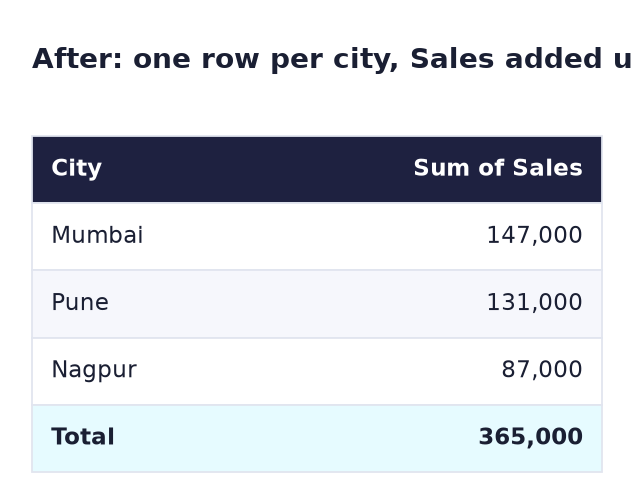
Mumbai has 4 rows: 42,000 + 61,000 + 8,000 + 36,000 = 147,000. Power BI does this adding for us when we put City and Sales into one chart. We do not write any formula in this lab; the chart sums the Sales column automatically.
Steps
- Create a folder
Documents\PowerBI-Labsand savecity_sales.csvinto it. Do not open and re-save the file in Excel first. - Open the Microsoft Store, search Power BI Desktop, and click Get (or Install). When it finishes, open Power BI Desktop.
- If a sign-in window appears, close it with the X. You do not need an account for this lab.
-
On the start screen, click Blank report.
What you should see: an empty white canvas in the middle, and on the right the Visualizations and Data panes.
-
On the Home ribbon, click the arrow under Get data and choose Text/CSV.
-
Go to
Documents\PowerBI-Labs, selectcity_sales.csvand click Open.What you should see: a preview window with 4 columns (Date, City, Product, Sales), 12 rows, and Delimiter: Comma at the top.
-
Click Load (not Transform Data; we do not need to clean anything today).
What you should see: in the Data pane on the right, a table named city_sales with the fields Date, City, Product and Sales. Sales has a Σ sign, which means Power BI will add it up.
-
Click Table view (the grid icon on the left edge) and check that there are 12 rows. Then click Report view (the top icon) to go back to the canvas.
- In the Visualizations pane, click the Clustered bar chart icon (horizontal bars). An empty chart appears on the canvas.
- From the Data pane, drag City into the Y-axis box of the chart.
-
Drag Sales into the X-axis box.
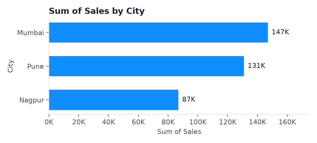
What you should see: three horizontal bars titled Sum of Sales by City: Mumbai about 147K, Pune about 131K, Nagpur about 87K.
-
Make the biggest city appear on top: hover over the chart, click More options (…) → Sort axis → Sum of Sales, and again … → Sort axis → Sort descending.
- Show the numbers on the bars: with the chart selected, click Format visual (the paint-brush icon in the Visualizations pane) → Visual → switch Data labels to On.
-
Drag the corner of the chart to make it bigger.
What you should see: a chart like the one below.
-
Click File → Save as, go to
Documents\PowerBI-Labs, name the fileLab-C-city-salesand click Save. Keep this file; Lab D starts from it.
Ravindra Bagale's Tip
Many students open the CSV in Excel "just to check" and press Save. Excel can change the date format or add symbols, and then Power BI reads Sales as text and shows Count of Sales instead of Sum. Download the file again and load it straight into Power BI. Bilkul visru naka.
Ravindra Bagale's Tip – मराठी
बरेच students CSV "फक्त check करायला" Excel मध्ये उघडतात आणि Save दाबतात. Excel date format बदलू शकतो किंवा symbols टाकू शकतो, मग Power BI Sales ला text समजतो आणि Sum ऐवजी Count of Sales दाखवतो. File पुन्हा download करा आणि थेट Power BI मध्ये load करा. बिल्कुल विसरू नका.
Ravindra Bagale's Tip – हिंदी
बहुत से students CSV "बस check करने के लिए" Excel में खोलते हैं और Save दबा देते हैं। Excel date format बदल सकता है या symbols जोड़ सकता है, फिर Power BI Sales को text समझता है और Sum की जगह Count of Sales दिखाता है। File फिर से download करो और सीधे Power BI में load करो। बिल्कुल मत भूलना।
Common mistakes
| Mistake | What happens | Fix |
|---|---|---|
| Picking Clustered column chart | Bars stand up instead of lying down | It still works, but for this lab click Clustered bar chart (bars go left to right) |
| City and Sales in the wrong boxes | You see one bar per sales amount, or a count | City → Y-axis, Sales → X-axis in a bar chart |
| Chart shows Count of Sales | Sales was loaded as text | Click Transform data, select the Sales column, Data type → Whole Number, then Close & Apply |
| Clicked Transform Data by mistake | Power Query Editor opens and you feel lost | Click Close & Apply (top left) and continue |
| Dates look wrong (for example 01-05 read as 1 May) | The file was re-saved in Excel with another date format | Download the original file again; it uses the safe 2026-01-05 (year-month-day) format |
Self-check checklist
0 of 6 done
Try-at-home challenge
On the same page, build a second chart without looking at the steps:
- A Clustered column chart of Sales by Product.
- A Slicer (a clickable filter box on the report) with the City field.
- Click Pune in the slicer. Which product sold the most in Pune, and how much?
Check your answer
All cities: Mobile 176K, Laptop 163K, Headphones 26K. With Pune selected: Mobile 69K (38,000 + 31,000), Laptop 55K, Headphones 7K. So Mobile is the top product in Pune.
Samjla ka? Get data, Load, drag two fields, and the question is answered. Aata pudhe jaauya: in Lab D we write our first CALCULATE measure on this same file.