Labs · Power BI
Lab: Build a Star Schema – One Sales Fact Table with Date, Product and City Dimension Tables
Course: Power BI · Chapter 11: Data Modelling
Chapter 11 teaches data modelling; this lab builds the star schema that most later labs use.
Download pbi_sales.csv (fact, 24 orders) Download pbi_products.csv (4 products) Download pbi_cities.csv (4 cities)
Chala mitrano! A good model is like a well-arranged kitchen: the main dish in the middle, and everything you need around it within one step. In Power BI that shape is called a star. Fact table in the centre, dimension tables around it. Build it once properly and every report after that becomes easy. Paaya pakka, tar imaarat pakki!
चला मित्रांनो! चांगलं model म्हणजे नीट लावलेलं स्वयंपाकघर: मुख्य पदार्थ मध्ये, आणि लागणारं सगळं एका पावलावर आजूबाजूला. Power BI मध्ये त्या आकाराला star म्हणतात. Fact table मध्यभागी, dimension tables आजूबाजूला. एकदा नीट बांधलं की पुढचा प्रत्येक report सोपा होतो. पाया पक्का, तर इमारत पक्की!
चलो दोस्तों! अच्छा model एक सजी हुई रसोई जैसा है: मुख्य dish बीच में, और ज़रूरत की हर चीज़ एक कदम पर आसपास। Power BI में उस shape को star कहते हैं। Fact table बीच में, dimension tables आसपास। एक बार ठीक से बनाओ, फिर हर report आसान हो जाती है। नींव पक्की, तो इमारत पक्की!
Suppose we are…
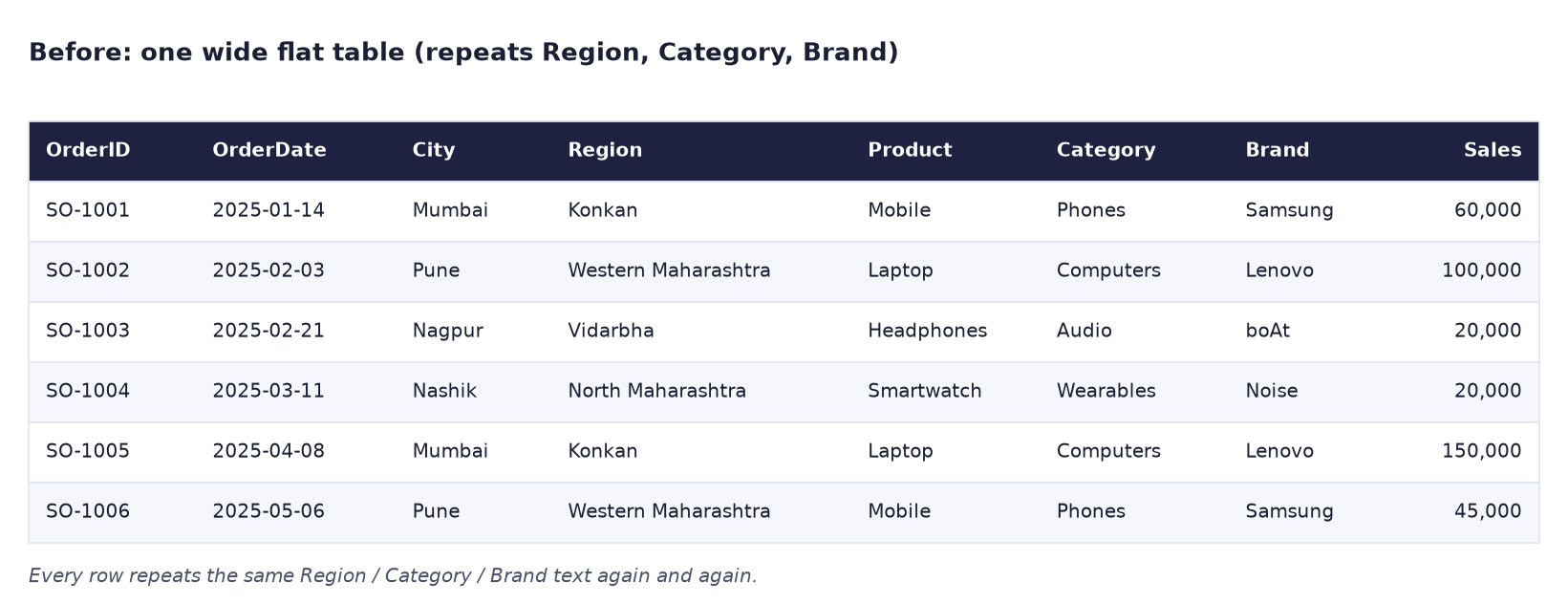
Suppose we are a BI developer at Croma. The first version of our report used one wide table where every order row also carried Region, Category and Brand text. It worked for 24 rows, but with millions of rows it would be slow and hard to change: if "Western Maharashtra" is renamed, millions of rows must change.
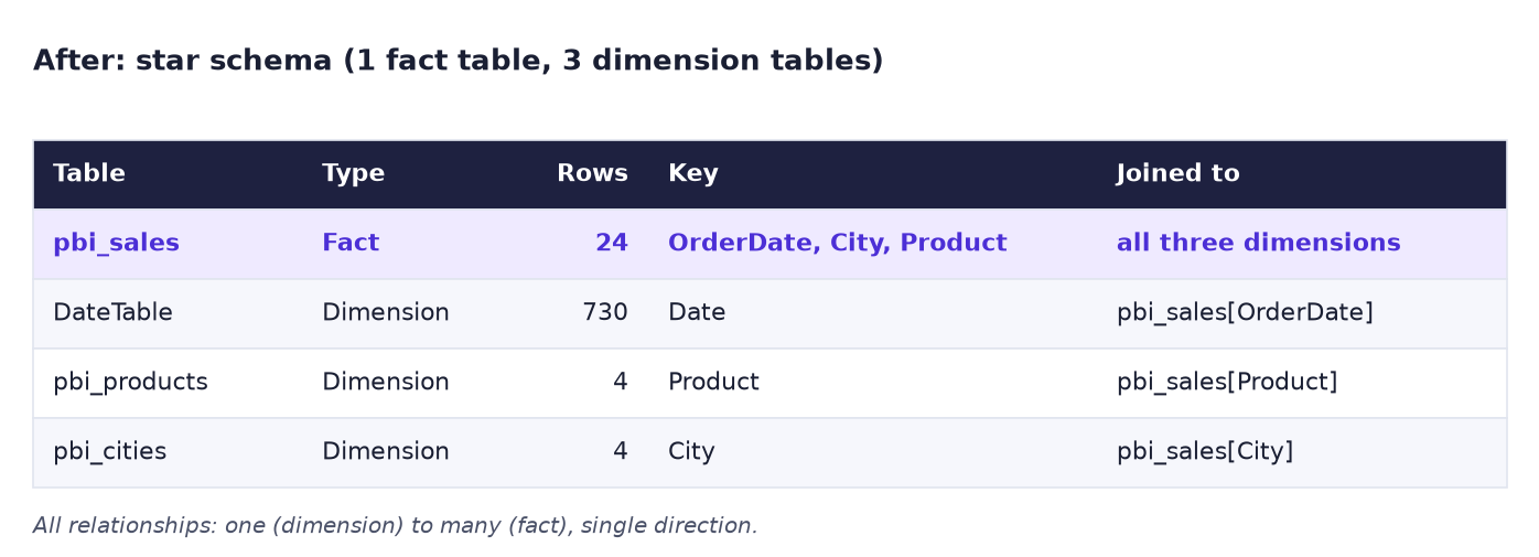
A star schema splits this into:
- One fact table (
pbi_sales): one row per order, with numbers (Units, Sales, Cost) and keys (OrderDate, City, Product). - Dimension tables: one row per thing we slice by.
pbi_products(Category, Brand),pbi_cities(Region, Manager, Target) and a DateTable (Year, Quarter, Month).
The data is sample data made up for practice.
Goal of this lab
By the end you will have:
- Three loaded CSVs and one DAX DateTable (730 days of 2025 and 2026).
- Three one-to-many, single-direction relationships in Model view.
- A matrix of Category × Year and a table by Region, both adding up to 1,302,000.
What you need (all free)
- Power BI Desktop.
- Download pbi_sales.csv (fact, 24 orders)
- Download pbi_products.csv (4 products)
- Download pbi_cities.csv (4 cities)
- 40 minutes.
The data: before and after
Before. One flat table repeats the same Region, Category and Brand text on every row.
After. One fact table in the middle and three small dimension tables around it.
The formula
The date table is one DAX formula. It makes one row per day and adds the columns we want to slice by:
DateTable =
ADDCOLUMNS (
    CALENDAR ( DATE ( 2025, 1, 1 ), DATE ( 2026, 12, 31 ) ),
    "Year", YEAR ( [Date] ),
    "Quarter", "Qtr " & QUARTER ( [Date] ),
    "Month No", MONTH ( [Date] ),
    "Month", FORMAT ( [Date], "MMMM" )
)
CALENDAR ( start, end )returns a one-column table called Date with every day in between: 365 + 365 = 730 rows.ADDCOLUMNSadds Year, Quarter, Month No and Month to each day.
And the measure we use everywhere from now on:
Total Sales = SUM ( pbi_sales[Sales] )
A relationship works like a VLOOKUP that is always on: each order row "looks up" its product, its city and its date in the dimension tables. Filters flow from the one side to the many side, that is from the small table to the fact table.
Steps
-
In a blank report, load the three CSVs one by one: Get data → Text/CSV → (file) → Load, for
pbi_sales.csv,pbi_products.csvandpbi_cities.csv.What you should see: three tables in the Data pane.
-
Click Model view (third icon on the left). Arrange the boxes so that pbi_sales is in the middle.
What you should see: Power BI may already have drawn lines from pbi_products and pbi_cities to pbi_sales (it auto-detects columns with the same name). If not, drag pbi_products[Product] onto pbi_sales[Product], and pbi_cities[City] onto pbi_sales[City].
-
Go to Report view. Click Modeling → New table, paste the DateTable formula above and press Enter.
What you should see: DateTable in the Data pane with Date, Year, Quarter, Month No and Month. In Table view it shows 730 rows.
-
In Table view, select DateTable and click Table tools → Mark as date table. Choose the Date column and click OK (or Save).
- Still in Table view, select the Month column and click Column tools → Sort by column → Month No. This keeps January before February instead of alphabetical order.
-
Go to Model view and drag DateTable[Date] onto pbi_sales[OrderDate].
What you should see: a new line from DateTable to pbi_sales with 1 on the DateTable side and * on the pbi_sales side.
-
Double-click each of the three lines to check them: Cardinality: Many to one (*:1) (seen from pbi_sales) and Cross filter direction: Single. Click OK or Cancel.
- In pbi_sales, hold Ctrl and click City, Product and OrderDate. Right-click → Hide in report view. Report builders should use the dimension columns instead.
- Right-click pbi_sales → New measure:
Total Sales = SUM ( pbi_sales[Sales] ). -
In Report view, add a Matrix: Rows = pbi_products[Category], Columns = DateTable[Year], Values = Total Sales.
What you should see: Audio 48,000 / 24,000; Computers 450,000 / 300,000; Phones 255,000 / 135,000; Wearables 65,000 / 25,000. Column totals 818,000 (2025) and 484,000 (2026); grand total 1,302,000.
-
Add a Table with pbi_cities[Region] and Total Sales.
What you should see: Konkan 439,000, Western Maharashtra 346,000, Vidarbha 260,000, North Maharashtra 257,000, Total 1,302,000.
-
Save as
Lab-11-star-schema. Later labs (hierarchies, maps, drill-through, RLS) start from this file.
Ravindra Bagale's Tip
If a matrix shows the same number on every row, the relationship is missing or points the wrong way. Go to Model view and check that there is a line between those two tables and that the arrow points towards the fact table. Same number everywhere means: check the line first!
Ravindra Bagale's Tip – मराठी
Matrix मध्ये प्रत्येक row वर तोच number दिसत असेल, तर relationship नाही किंवा चुकीच्या दिशेने आहे. Model view मध्ये जा आणि check करा की त्या दोन tables मध्ये line आहे आणि arrow fact table कडे आहे. सगळीकडे तोच number म्हणजे: आधी line check करा!
Ravindra Bagale's Tip – हिंदी
Matrix में हर row पर वही number दिखे, तो relationship नहीं है या गलत दिशा में है। Model view में जाओ और check करो कि उन दो tables के बीच line है और arrow fact table की तरफ है। हर जगह वही number मतलब: पहले line check करो!
Common mistakes
| Mistake | What happens | Fix |
|---|---|---|
| Using pbi_sales[City] in a visual with pbi_cities[Region] | Works, but confuses which table filters which | Hide the key columns in the fact table; slice by dimension columns |
| OrderDate loaded as Date/Time | The relationship to DateTable finds no match; Year shows blank | Change OrderDate to Date in Power Query |
| Cross filter direction set to Both "just in case" | Slow models and ambiguous paths later | Keep Single unless you have a clear reason |
| Month sorted alphabetically (April, August…) | Charts look random | Sort by column → Month No |
| DateTable too short (e.g. only 2025) | 2026 sales disappear when you slice by Year | The date range must cover every date in the fact table |
| Using DateTable[Date] without marking it | Time-intelligence functions may misbehave | Mark as date table |
Self-check checklist
0 of 5 done
Try-at-home challenge
Using only the model (no new measures), find Pune's sales by Brand. Then explain in one sentence how the filter travels from pbi_cities to pbi_products.
Check your answer
Make a table with pbi_products[Brand] and Total Sales, and a slicer with pbi_cities[City] set to Pune: Lenovo 200,000, Samsung 105,000, Noise 25,000, boAt 16,000 (total 346,000). The filter goes from pbi_cities to pbi_sales (one to many), keeps only Pune's orders, and the Brand rows group those orders through the pbi_products relationship. The two dimensions never touch each other directly: the fact table in the middle connects them. That is the star.
Samjla ka? One fact in the middle, dimensions around it, one-to-many and single direction. Aata pudhe jaauya: add a Year › Quarter › Month hierarchy and group cities into regions.